Arjen Groeneveld
August 21, 2024
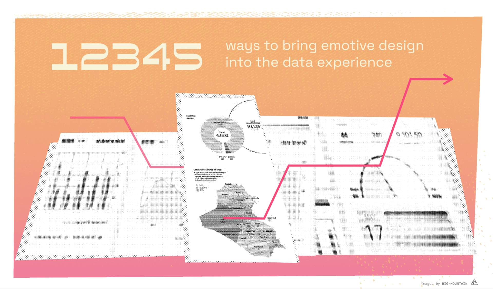
Design is about emotions. Yes, even that KPI dashboard that you are working on for your client has emotional components. Just think about it; sales numbers going down? You show a downwards pointing arrow and quite likely some red along with it. Blue skies ahead? Everything looking rosy and peachy? You’re likely using colours, icons and visual metaphors to convey these feelings.
Recently, I participated in Future Fridays May workshop about Nudging users through emotive design. Having a social psychology background I was particularly interested in the subject and I didn’t know much about emotive design yet. Apart from it being a great workshop, I learned new things which I am sharing in this article.
Emotive design is “design that is based on empathy”. The theory is that when design triggers an emotional response in the user it strikes a deeper chord and thereby makes the information that is communicated more personally relatable. When designers deeply understand and incorporate emotional context into their design, they can craft experiences that resonate on a deeper, emotional level. For designers who work to create user experiences, emotion-driven design is — therefore — a key approach.
This may be even more important for data visualization designers. We need to strike a chord with users to make a point and make data meaningful:
“Without some emotional valence many presentations will not be effective simply because the audience will not care. Adding emotive images can turn a disinterested audience into an attentive audience” (Colin Ware)
Designers can use colours, shapes, typography, imagery and other visual elements to strike an emotional chord. How we do this effectively is in part dependent on our thorough understanding of the audience and the emotion that we want to convey. For more on this, see the discussion on the Wheel of Emotion from the Interaction Design Foundation.
Disclaimer: This list is by no means an exhaustive list of ways to elicit emotions in our designs. Emotions are very subjective, different visual elements can mean different things to different cultures and people. Emotional reactions are also very much dependent on the context in which people are when looking at the design. However these 5 ways were discussed during the workshop and seem most effective in eliciting emotions.
Example: As an example to showcase these 5 ways to convey emotion in design I will use the ‘Iraq’s bloody toll’ visualization made by Simon Scarr for the South China Morning post. It is one of the best ways I know of in which emotion is used in a dashboard and makes clever use of these 5 (and other) principles. I will be showing parts of it in this article, and the main piece can be seen here.
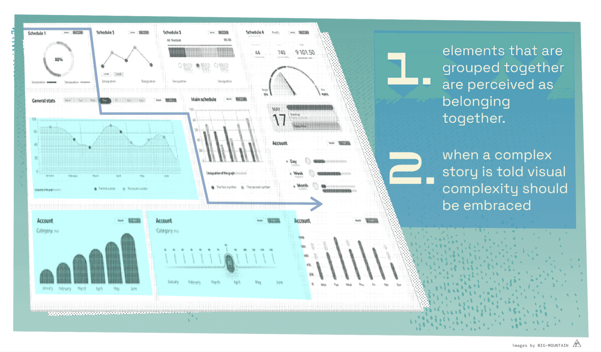
Usually described as the first principle of Gestalt theory and perhaps also the most important one; elements that are grouped together are perceived as belonging together.
Proximity not only improves the readability of the visualization, it also provides a visual information hierarchy that catches the attention, guides the information flow and enhances user understanding. Not something that communicates emotions directly but something that will make it easier to do so using other elements.
Just imagine; your audience is trying to make sense of your over-cluttered and complex dashboard or presentation and instead of conveying your message and getting an emotional reaction people just mostly experience frustration and incomprehension. Grouping elements together and leaving white space greatly improves the overall user experience and is really just the first prerequisite for any good design.
Understanding this basic principle can also prevent users from wrongly assuming that some elements belong together if they happen to be shown close to each other even if these elements are not meant to be seen that way..
Data is often shown in aggregate form to make sense of a large quantity of information and to base our decisions on. Of course, your monthly sales numbers in your KPI dashboard would look confusing if shown otherwise. But whenever there are personal stories involved complexity should be embraced. Data is often about people, and by showing individual stories we can make data more personable and strike a deeper chord with our audience. As Georgia Lupi puts it: “Whenever the main purpose of data visualization is to open people’s eyes to fresh knowledge, it is impractical to avoid a certain level of visual complexity.
Looking at complex visuals can however be a daunting task, so catching the attention in a certain way or having a place for the eyes to rest upon is important. This can be achieved with Proximity, white space and other Gestalt principles to guide the information flow. Like in a good book or movie, your attention is grasped and you are taken on a journey through the complexities of our reality.
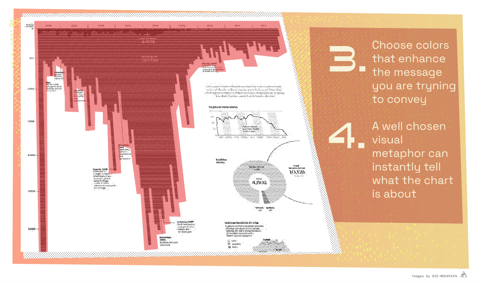
Colours are an obvious choice for conveying emotions, but colours can have many different meanings across different cultures. However many differences there are, in general a colour scheme or colour palette should not be chosen randomly, especially when the visual is supposed to strike an emotional chord. This is also why data dashboards made in the company colours can often fail to make a strong point.
In our example of ‘Iraq’s bloody toll’ the chosen colour scheme is an alarming red. It focusses us on blood-red which is also emphasized in the title. Imagine the overall colour being light blue, it would make for a very different story!
Although colours can mean different things for different people, Plutchik’s colour wheel can be of help choosing a colour for your overall design. Most important is that you are deeply aware of the emotional context and consider the emotions that you want to convey and try to imagine what your audience might experience when seeing your design.
Using an appropriate visual metaphor makes the point of your visualization extra powerful and should directly aid in understanding what your story is about. Providing information this way is a kind of ‘mapping’ (Nudge theory) that shows us what the data and graphics are about, without first explaining in text what we are looking at. With a well chosen visual metaphor people will directly say “I get it”!
In the example of ‘Iraq’s bloody toll’ the bar chart is chosen to go down, thereby resembling blood that drips downward. With the blood red colour and the ‘blood’ in the title it is altogether a bar chart that “hurts”. Additionally, choosing bars that go down adds to the overall feeling that something is wrong. Bars that go down are generally considered as bad, whereas bars that go up are seen as good.
But be careful! Sometimes an obvious visual metaphor can call on the wrong emotions. Or extreme visuals can become over the top and will be met with resistance.
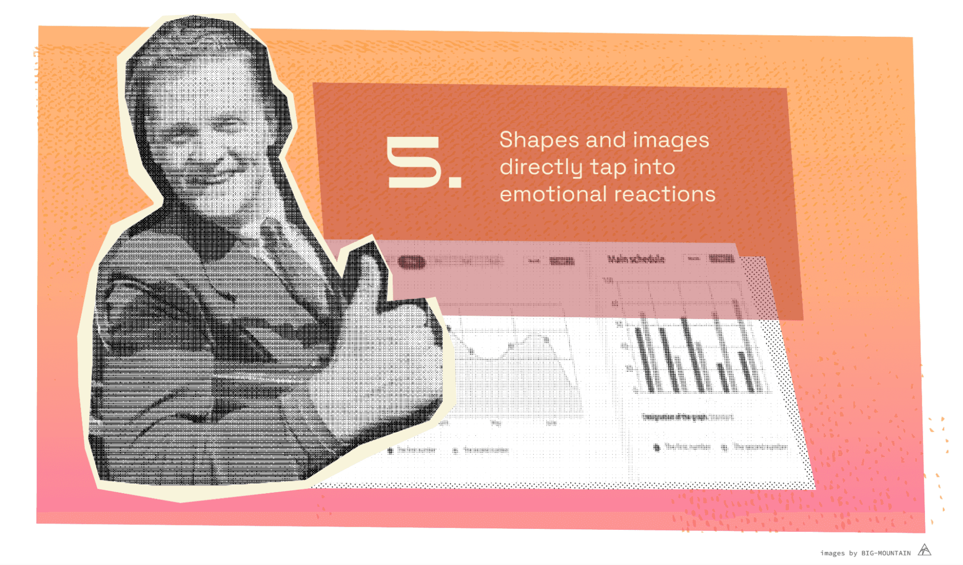
The use of images is perhaps the most effective way of all to trigger an emotional reaction. As we stated earlier, using emotive images can turn a disinterested audience into an interested audience. By simply showing an image or symbol or icon a visualization can at once show what the story is about and communicate information within the overall picture.
In the KPI dashboard that we have used as an example, the arrows that go up or down according to profits or loss, or the callouts that look like traffic signs are obvious choices when conveying some emotion. But even more powerful is showing a picture of what the story is about, to directly drive home the emotive story.
As with visual metaphors, making imagery too extreme will only get a counteractive reaction, so don’t aim to get too much emotional reaction as this will be met with skepticism. People will automatically form a counter opinion to mitigate the stress brought upon them by negative content.
In this article I have shared 5 ways to use emotive elements in data visualization design. They are principles that make reading a data design easier (Proximity and Visual complexity) and convey emotions better (colours, visual metaphors and images).
A good data story should be presented as interesting as possible, pulling you into the story and inviting you to further investigate. This can be done with a clear information flow and hierarchy as described in the Gestalt laws.
Adding complexity and not ’dumbing down’ the information too much will trigger interest in viewers, especially when data is represented in beautiful or original ways, by choosing a visual metaphor that directly communicates what you are showing.
A well thought-out colour scheme can further point out the emotions that are being conveyed and smart use of icons and images can further trigger emotions. Adding these elements in just the right amounts is the true art of storytelling in data visualization.
Further reading/ viewing about “Iraq’s bloody toll”:
Eager eyes, Robert Kosara
Andy Cotgreave

Arjen Groeneveld is a data visualisation and information designer based in Amsterdam. He has a background in social psychology, data analytics, and market research. He currently works for FCB Health NY, where he focuses on bringing data to life in impactful and understandable visuals.
Soho Works White City,
Television Centre,
101 Wood Lane,
London,
W12 7RJ