Visual content from around the web – the pieces you need to see this week vol. 69
Reading time
Category
Scrollable story
Have you ever wondered why we cry? It’s a topic that we probably don’t talk about a lot, but it’s something we all experience for various reasons. This scrollable story by BBC iWonder dives into the topic — even the differences between men and women, which is interesting. For example, as toddlers, boys actually cry more than girls.
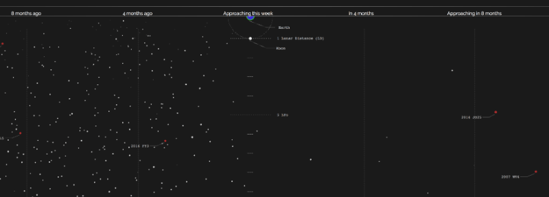
Asteroid: Near Earth approaches
Until an Asteroid
Data visualisation
The Earth has been battered with asteroids since the beginning of time — ask the dinosaurs about it. It’s a scary thought that they’ll come a day where one will be on course to hit us and may be big enough to cause life-threatening damage. Hopefully, by then, we’ll be able to divert it or blow it to pieces like in the film Armageddon. This data visualisation shows the asteroids that have passed in the last 8 months and the ones that are approaching in the next 8 months — delightful stuff! :-/

The anatomy of a Starbucks beverage
Starbucks
Infographic
Are you a coffee aficionado? Well, some of us aren’t. And we’d probably struggle to tell you the difference between a Flat White and a Latte. To show what their coffees are made of, Starbucks created this infographic visualising their beverages. Mmm, time for a coffee!

Bill Gates
GIF
Bill Gates went from a billionaire tech giant to a billionaire philanthropist. One of the problems he’s been tackling in the world is malaria through his foundation The Global Fund to Fight AIDS, Tuberculosis and Malaria. As of 2012 US$1.3 billion has been donated and Bill Gates shared a GIF of showing the percentage of population in Africa sleeping under a bed net. The progress made is impressive and essential.

Selecting the right chart for data visualisation needs
Big Data Analytics Guide
Data visualisation
When working on data visualisation it’s essential that you pick the right chart to display your data and communicate your message. Big Data Analytics Guide have created this great guide with all the charts you can use to show comparison, distribution, composition, and relationship.

A field guide to red and blue America
The Wall Street Journal
Data visualisation
The US presidential election has dominated the headlines for most of the year so far, and as we move into the final stages it is interesting to see which states could swing the result either way. There are many safe havens for both the Democrats and Republicans, but many more still that tend to flip-flop one way or another. The Wall Street Journal has used small multiples to show the support each part has received over the last 30 years, which shows that states such as Iowa, New Hampshire and New Mexico could be crucial come November.

Just how big are the largest known stars?
BBC iWonder
Animation
A brilliant short animated video by BBC iWonder explores how mind-boggling big our stars are. For example, it would take you 206 days to go around the sun — not that you’d want to that. And if you have the time, then fly around Aldebaran, it’d only take 25 years.

Sizing up sharks, the lords of the sea
National Geographic
Scrollable story
It’s hard to think of a shark and not have your brain immediately present you with a horrific scene from Jaws where a great white shark is lunging at you whilst you’re sat on your boat. But there are lots of different types of sharks that vary in size. This immersive scrollable story explores the different types and sizes of predators that are crucial to the ocean’s health.