Richard Silvester
April 1, 2016
50 years of Batman on film: how has his physique changed?
From: The Economist
Infographic
With Batman vs Superman being released to the box office, March has brought us Ben Affleck’s debut into the DC super franchise, competently filling the shoes of his predecessors. While each generation will immediately associate one of the many actors to play the role of their favourite “Batsy” (Joker reference, Wahey!) the Economist has put out this great graphic on how each Bruce Wayne has quite literally measured up to the next! 
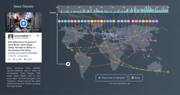
Twitter Turns 10: How Tweets spread across the world
From: Twitter
Interactive Module
The 21st March 2016 marked the the 10 year anniversary of the launch of Twitter, and when it launched back in 2006 with Twitter CEO Jack Dorsey famous first tweet ‘just setting up my twttr’ I bet not many of us thought having the ability to share small snippets of thought would have such global impact. This cant been seen more in the rate in which information can travel across the earth, and sometimes even space, and our news, ideas, events, moments in time all now have the ability to access a global audience. To celebrate their 10-year anniversary and to highlight the platforms amazing ability to spread news and information across the globe, far faster than any other platform or outlet can, a interactive module has been created to visualise just that. Showing the spread of 6 of twitters most iconic tweets in either realtime, or a multiple of it, the module illustrates how a tweet travels worldwide by use of lines and flying bubbles to show the influx of Retweets to a given country. Go watch the incredible rate at which the tweets reached global coverage and explore by clicking on the timeline to see what happened at any given moment.
From: Alberto Lucas López for South China Morning Post newspaper (Hong Kong)
Infographic
It may have been 71 years since the US military dropped the ‘Fat man’ and ‘Little boy’ nuclear bombs on Nagasaki and Hiroshima but the world is still reeling from the effects. But just how big was the devastation geographically? Alberto Lucas López for The South China Morning Post created this infographic detailing the radiuses of immediate destruction on the 20 cities their readers most commonly originate from, and the map of London caught our eye. It’s a period of history we never want to see repeated, but there’s no doubt that this infographic puts the impact the ‘Fat Man’ bomb would have on modern cities today into perspective.
From: Roxana Torre
Interactive visualisation
In a country debating the issues of privacy and security (see: Apple vs the FBI), the TPP and cyber censorship and Mark Zuckerberg (controversially) trying to provide internet to the masses in India, it’s enough to make you sit back and wonder what the rest of the world is doing with the internet; If they have access to it, the content they use and its relevance to that country, their right to access information and the impact the web is having on that population too. Roxana Torres set up this interactive module based on the ‘Web Index’ compiled by the World Wide Web Foundation visualising how ‘healthy’ the web is in each country based on four subindexes. This is definitely a visualisation we’d like to see updated as the debates continue.
THE GRAPHICS IN “THE MARTIAN” ARE SO REALISTIC YOU FORGET THEY’RE FAKE
From: Visual News
VISUAL DESIGN
Nominated for best Picture at the Oscars this year, the Martian was a must see film of 2015, predominantly due to the special effects and inspiring set design – However, Visual News looks at the inspiring graphic interfaces that were a key component in delivering key plot information to the the viewer throughout the movie. Designed by Territory Studio and working with NASA data Scientists, the team took much of their inspiration from technologies currently being developed by NASA in order to design a realistic, futuristic interface for the film – Even though the information displayed throughout was complete horseradish, the level of detail and pixel perfect design was well executed and gives us a glimpse into what the future of Data visuals may look like. 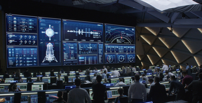
From: Russell Haworth
Infographic
Back in 1985, the .uk domain was one of the first ever country-code domains to be created, and continues to rank as one of the most popular to this day. This infographic poster from Russell Haworth proportionally scales land masses by area depending on how many domains are registered there, and produces some unexpected results. The tiny south pacific island of Tokelau overshadows even the US and Canada, and there are many more surprises to be found in this twisted view of the online world. 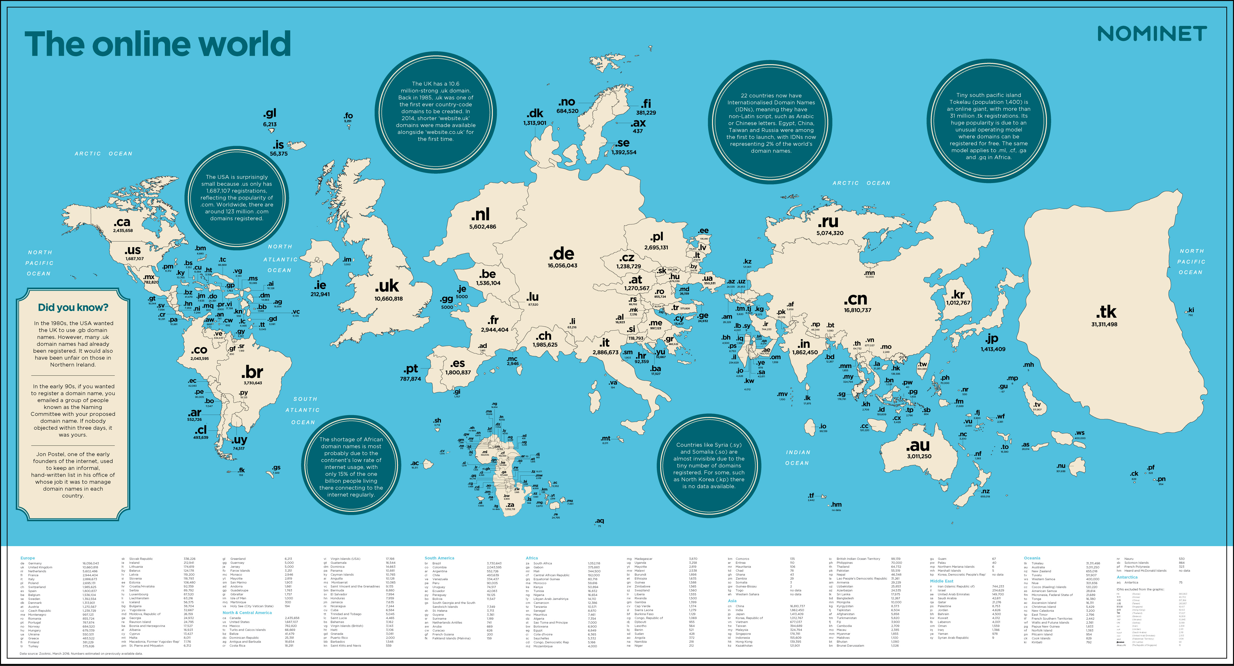
From: Andy Woodruff
Infographic
We have a newfound respect for those tasked with sea navigation this week. Getting from A to B using traditional maps is not as easy as it may appear, as two-dimensional global representations such as the Mercator projection have a tendency to mess with how land masses are positioned. A new series of maps produced by cartographer Andy Woodruff asks the question, if you were to set sail from different continents and stay true, where would you end up? The answers may surprise you, and it is easy to see why it can be so easy to end up lost at see. Amazingly, it appears to be possible to sail all the way to Australia from the UK by heading in a straight line, and we would love test this theory if a new interactive version is ever developed.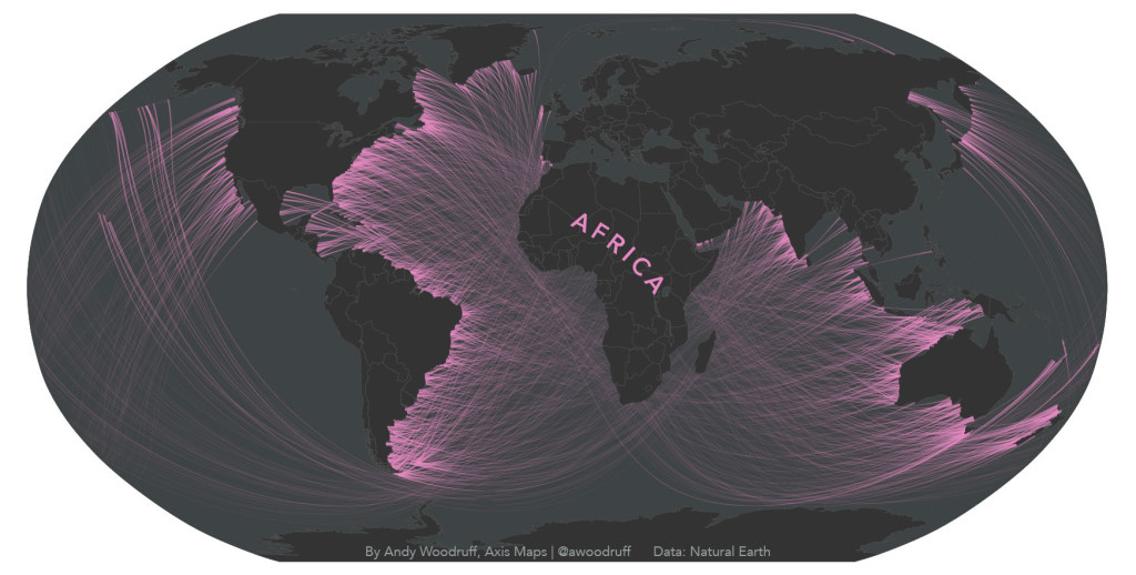
Christmas with all the trimmings!
From: todayinfographic.com
Illustration/Infographic
Ok, so we know that we are currently closer to “Christmas Past” than we are to “Christmas Future”, however in this Infographic for Barclays is somewhat of a “Christmas Present”, showcasing some great illustrations. The combination of hand drawn type and food photography is pretty well executed if you ask me! (illustrations by Laura Hunter).
Soho Works White City,
Television Centre,
101 Wood Lane,
London,
W12 7RJ