Nadieh Bremer
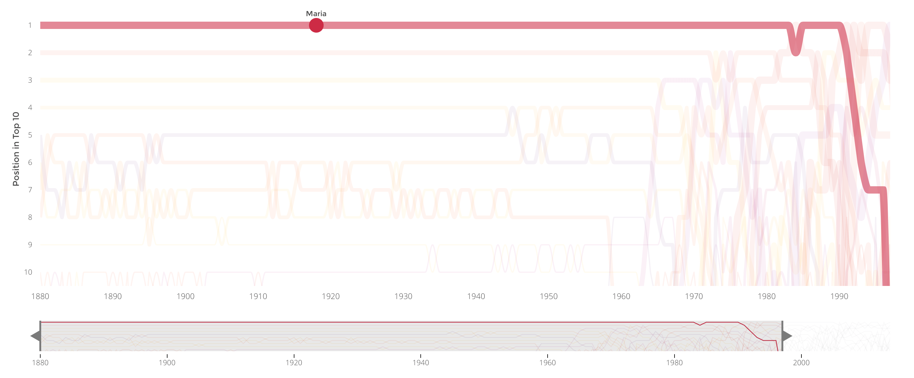
Earlier this week we waited with bated breath to discover what name our favourite royal couple had chosen for their little princess. Would they go traditional, or perhaps something a little more 21st century? You never know, maybe they consulted this very data visualisation on the most popular names since 1880 to help make their decision. Developed by Nadieh Bremer, we see the rise and fall in popularity of different baby names over the last century. The Dutch example is particularly intriguing, with some erratic shifts from the 1970’s onwards, and remarkable consistency before then, leaving us much to ponder over. Why would a delightful name like ‘Maria’ top the charts for a century, and then fall out of the top ten completely during the 1990s? And will the naming of Princess Charlotte have any impact on naming trends in the years to come?
Information is Beautiful

The internet has certainly come a long way in a very short space of time, and this new interactive from Information is Beautiful provides a glimpse into what the future will hold for The Internet of Things. Soon we can expect a whole manner of “things” to be monitoring and talking to each other so they can (hopefully) make our lives easier. From clothing to beds, it sounds there isn’t going to be a single aspect of our lives that remains offline, a prospect that hackers are no doubt going to relish.
Los Angeles Times

Ever wondered how modern musical tastes compare with those from the past? When were drums most popular, and are guitars making a comeback? By examining quantifiable digital elements in the music, The Los Angeles Times has visualised 17,000 songs featured in the US Billboard Hot 100 over the last five decades by tonal quality, revealing the changing tastes of generations. Now, this goes some way to explaining your parents peculiar record collection they have amassed over the years.
The Economist

How big is the divide between white and black America? A new interactive chart from The Economist splits the United States into two and compares various development index measures with the rest of the world. Some may be surprised by the gulf that still exists between the two, with infant mortality twice as prevalent among black Americans than their white neighbours. It is a revealing insight into one of the largest and most diverse nations on earth.
Wall Street Journal
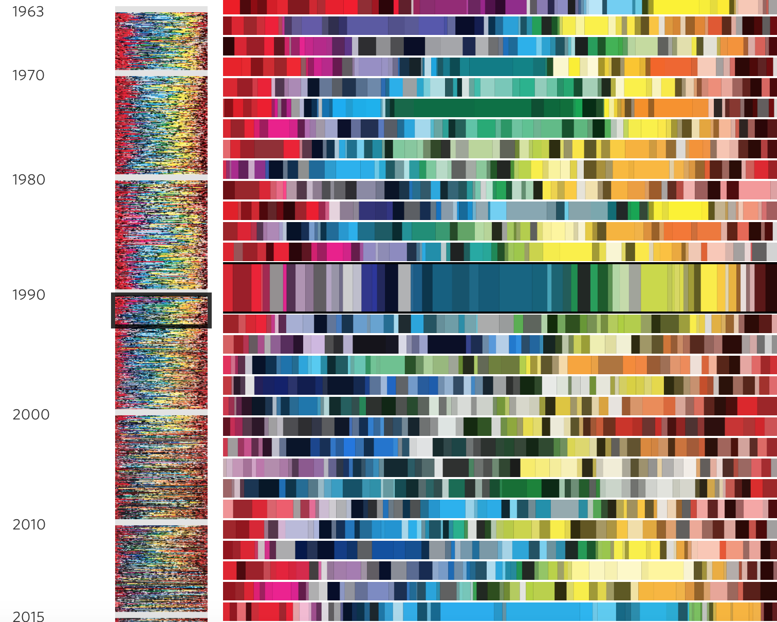
We saw Avengers Age of Ultron last week and it was nothing less than mind-blowing. So is this mesmerising colour palette timeline that celebrates 50 years of the popular comic books. You can spot a clear shift from bright and vivid tones and cartoony illustrations to darker colours and more grown up illustrative style. You can read more about this shift and how illustrators have approached the iconic comic cover, here.
CNN Money

The average American home has changed, considerably in just a few decades. This animated graphic from CNNMoney shows how square footage and other factors have shifted over time. We would love to see a version which displays UK homes in a similar way, comparing the average home in London with other areas to highlight the differences. Including other details like the number of gadgets and average television sizes would also give a fascinating insight into how lifestyles differ around the country and across generations.
The Washington Post

Later today, the Arsenal of Democracy Flyover will be taking place over Washington, as World War II vintage aircraft fill the sky in a 50-minute aerial salute to veterans. It will mark the 70th anniversary of the end of the war in Europe. These incredible machines will be familiar to many. However the Washington Post has produced a handy guide, and a beautiful animation is showing how these appear from the ground. We salute all who have piloted these legendary contraptions over the years.
The Guardian

We were all prepared for a tight battle and a possible hung parliament after the UK general election, but at the time of writing it looks like a rather convincing win for the Tories. For many it has been a long and confusing process, so The Guardian produced The Election Explained, for Non-Brits, a short and snappy video that covers the basics for anyone unfamiliar with the system. The humorous style is a great way to liven up what is often considered a humdrum subject, and we imagine that many British folks will also find plenty to learn about this incredibly complex process.
We’re hiring! Several new awesome roles within the infogr8 family including account management, information designer & web development.