ICYMI – Weekly round up of inspiring visual content Vol. 38
Reading time
Category
Missing your data-led visual content fix? Fear not, we got you. From the history of the entire universe to the new brand guidelines of The Guardian, the team at infogr8 have curated the most inspiring and interesting visual content we have stumbled on this week.
Nicholas Felton 2014 Annual Report
Nicholas Felton
Annual Report
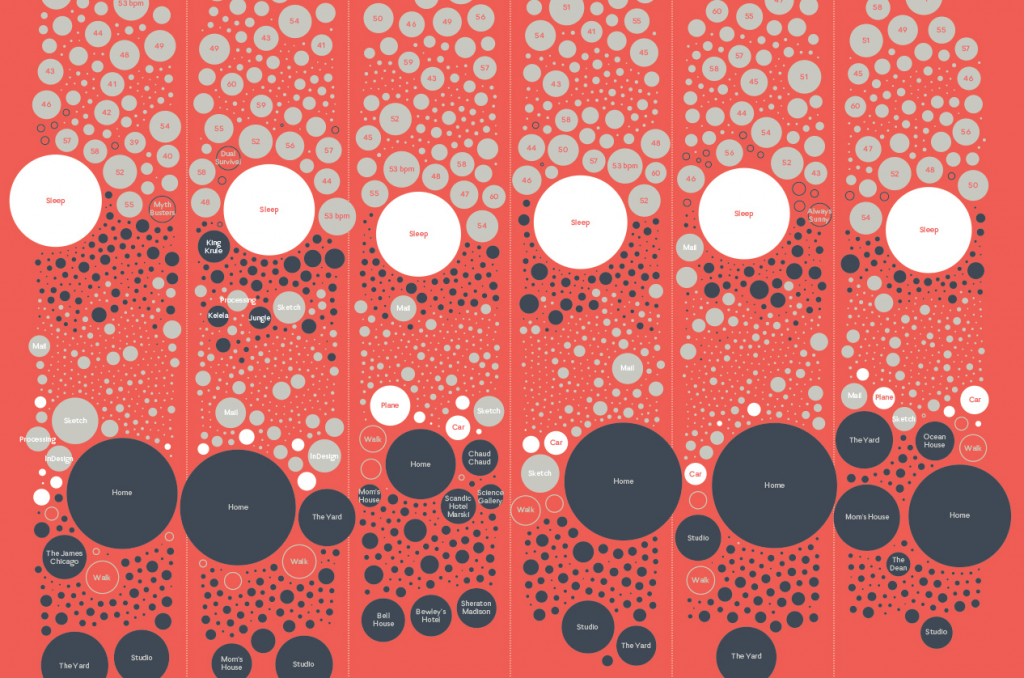
It’s that time of year again when we get to take a sneak peek into the life of interface designer and data viz guru Nicholas Felton. Over the last decade he has published annual reports that visualise personal data he collects on a daily basis, revealing correlations between his running and weight, television viewing and GPS location, plus so much more. The world has changed a lot since the first edition, and many of us are now also tracking our own personal data using a Jawbone or a similar device. Our lead designer also embarked on a similar project when he created a series of data visualisation posters during his MA using personal data of a similar nature. Becoming self aware of your actions encourages you to do things that you would not normally do, and thankfully that’s something more of us than ever are benefiting from.
Matan Stauber
Data driven website
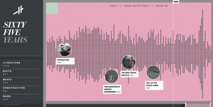
What would Wikipedia entries look like if they were displayed as individual blips along a single, 14 billion year timeline? Matan Stauber obviously asked himself the same thing, and to find out he has created Histography, an interactive that plots key moments from the birth of the Universe, up to the Google developed driverless cars. We can even categorise events to focus on our particular area of interest, and hop straight to the Wikipedia entry from where it originated. Even the most hardcore general knowledge masters will surely find a wealth of information here to keep them entertained.
The Future as Foretold in the Past.
Giorgia Lupi
Data visualization

We are always been very curious about the future. The most illuminated of us wrote down their concepts of the unforeseeable to feed our voracious hunger for knowledge and hope. Some of them depicted a bright and prosperous future for the human race, whilst other imagined the fall of our supremacy or intergalactic wars. Giorgia Lupi, created a data visualization timeline gathering the data from the most famous works of fiction taking place in the near or far future to illustrate what will happen from now on. From Philip K. Dick to William Gibson and Isaac Asimov, this piece of visualisation depicts wealth of data whilst still easy to understand, thanks to the visual cues provided, and turns out as a really pleasurable reading.
Intellectual Property Magazine
Website Module

The number of trademark registrations in UK is rising since 2010, with an impressive +23%. On the over hand, granted patents are dropping over the same period of time. What is happing? Why is there such a difference? The Intellectual Property Magazine investigates these trends focusing on three main areas, Trademarks, Patents and Designs. Based on the data of the Facts and Figures report 2014 from the Intellectual Property Office, they designed a website module that allow users to select the topic they are more interested in and reveals a series of data and graphs about trends, locations, sectors, and most active brands, creating a visual picture of the situation for trademarks and patent in 2014.
Buck
2D Animated Video
Have you ever imagined a life without easy access to fresh and clean water? Imagine a life where you have to walk four kilometres a day to get water full of diseases. It is difficult for us to visualise something as terrible as the lack of water but for many women and children in developing countries this is quite common. The guys at Buck produced this amazing 2D animated video picturing a hypothetic family of a developed country struggling with the daily suffering on the poorest citizen of the third world. The video supports a strong message that must be shared across the world: access to clean water can help children to not skip school, empower women, boost economy and save thousands of lives.
An insight into The Guardian’s newly released brand guidelines.
Rebecca Fulleylove
Brand Guidelines

In this interesting article from Its Nice That, Rebecca Fulleylove explores the new brand guidelines of one of the most credible publishers in the UK. After years of work the team at The Guardian have been able to unify myriads of different style, typographic pattern, colour theory and grammars. As stated by Chris Clarke, deputy creative director at The Guardian, one of the biggest challenges was to create guidelines not only for the editorial side of the news company, but also for every other platform, business and sub-brand. The results of their efforts are quite impressive: the new brand guidelines are simple, consistent and coherent across all their assets.
Flowing Data
Website Module

The chances are that if you have a higher education degree you will earn more than those with a lower education level. This concept has inspired Nathan Yau from Flowing Data to elaborate this website module. Here, you can set a number of values, such as your income, commuting time and education level and find out how many other US workers are doing exactly like you. Do you think you are underpaid? Or do you feel that for the time you spend on public transport the new job offer is not worthy? Give a try to this interesting tool and maybe you won’t feel so alone anymore.
Eye-catching content: Visual storytelling lessons from Fairfax
Shorthand
Scrolling Scrolling Story

Creating media-rich, immersive visual content may look easy, especially with all of the new tools available to help create scrolling stories, however they still require careful planning, consideration and knowhow. Mark Stehle, art director at Fairfax Media recently shared some vital tips to help create engaging narratives. By sketching concepts first and creating a carful balance of text and media, we can craft emotive and immersive storytelling.
We’ll be sharing more inspiration next Friday, for now you can follow the team on Twitter @infogr8. Please tweet & share your viz spotting stories to be considered for our future rounds ups. #vizspotting #ddj.
We’re hiring! Several new awesome roles within the infogr8 family including account management, digital PR manager & web development.