Missing your data-led visual content fix? Fear not, we got you. The team at infogr8 have curated the most inspiring and interesting visual content we have stumbled on this week.
MailChimp’s 2015 Annual Report
Mailchimp
Annual Report
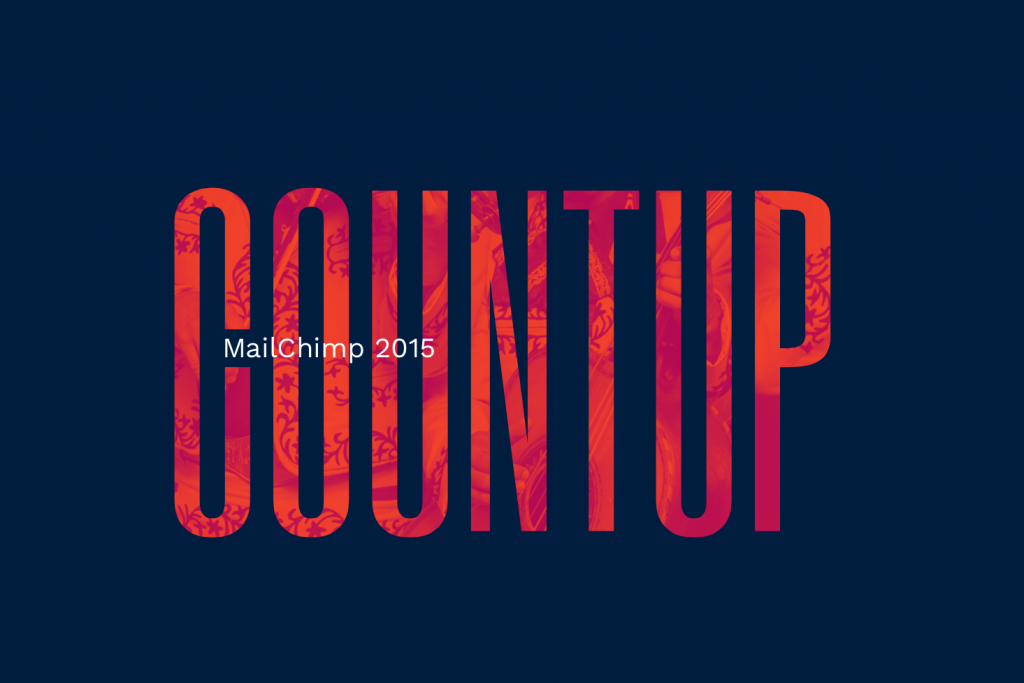
The awesome guys at Mailchimp are being awesome again with their Annual Report for 2015. What’s not to like about it — fun data, great visuals, and what seems to be an awesome workplace. And most importantly, it’s simple.
Gyroscope Annual Report
Gyroscope
Annual Report

A new year usually comes with a list of resolutions — more running, more travelling, yadda yadda yadda. And because you’re definitely going to fulfil these all of these resolutions (yeah, right), you’ll most probably need an app. Well, Gyroscope is an app which acts as a personal dashboard powered by your life. The CEO, Anand, seems to be “that guy” when it comes to sticking to resolutions — I mean just look at his annual report for 2015. He ran 220 miles last year, time for me to lay down and think about life.
Super Meta Infographic: Why Infographics Are Content Marketing’s Secret Weapon
Contently
Infographic

How do you best visualise how great infographics are? With an infographic, obviously! OneSpot break down the reasons why content marketers are using infographics in their communications.
Booze calculator: What’s your drinking nationality?
BBC
Interactive Module

As stringent new guidelines issued on alcohol were revealed this week, cut recommended drinking limits and say there is no such thing as a safe level of drinking. The new advice says men and women who drink regularly should only consume up to 14 units a week – thats the same as six pints of beer or seven glasses of wine. But have you ever wondered how your drinking matches up against the rest of the world? Well, today the BBC has released a simple interactive in where you you can enter in your weekly consumption and the it calculates how much you annual tipples add up to as well as letting you know which part of the world you would find drinkers of equal measure. Interestingly if you enter the new recommended units for the UK you would find that currently your average British male drinks 46% more and British women drink 28% more, looks like we all have a bit of work to do. Pop over and see what drinking nationality is.
How the World Travels
Jawbone
Data Blog

So, it seems that travelling results in walking more and getting 10 minutes more sleep — but that depends on where and what you’re doing. At beach locations people tend to sleep more and take fewer steps, which sounds right to me. Jawbone’s breakdown of it’s users data gives an insight to how different countries around the world have different travelling habits.
5 Content Marketing Trends for 2016
Ceros
Blog Post
There’s no surprise that 2016 comes with more interactive and fun ways of telling your story. Ceros have chosen the 5 that they think will be most important and some good examples of it being executed.
Blame the Weather
Tableau
Data Visualisation

We’re renowned for talking about the weather here in the UK, but it looks like we’re not alone. This data visualisation by Tableau shows how airports and flights in the US are affected by the weather with January looking like the worst month.
Why Infectious Bacteria are Winning
Quartz
Data Blog

There has been a war that has be raging for nearly 100 years, and you probably never guess who its between. Infectious bacteria and antibiotics have been going to battle across our immune systems our whole lives, and the infectious bacteria are winning. The reasons why are the subject of a great data blog by Keith Collins using quartz platform, in it he visualises the trends in the discovery and creation of these drugs, and how a slow down in the production and development over the last 40 years coupled with the adaptive nature of the infectious bacteria themselves that nearly a century after the discovery of penicillin, they are still killing around 700,000 people every year. Jump over to the blog here to uncover the details behind this story.