 Insight
ICYMI – Weekly round up of inspiring visual content Vol. 44
Missing your data-led visual content fix? Fear not, we got you. The team at infogr8 have curated the most inspiring and interesting visual content we have stumbled on this week.
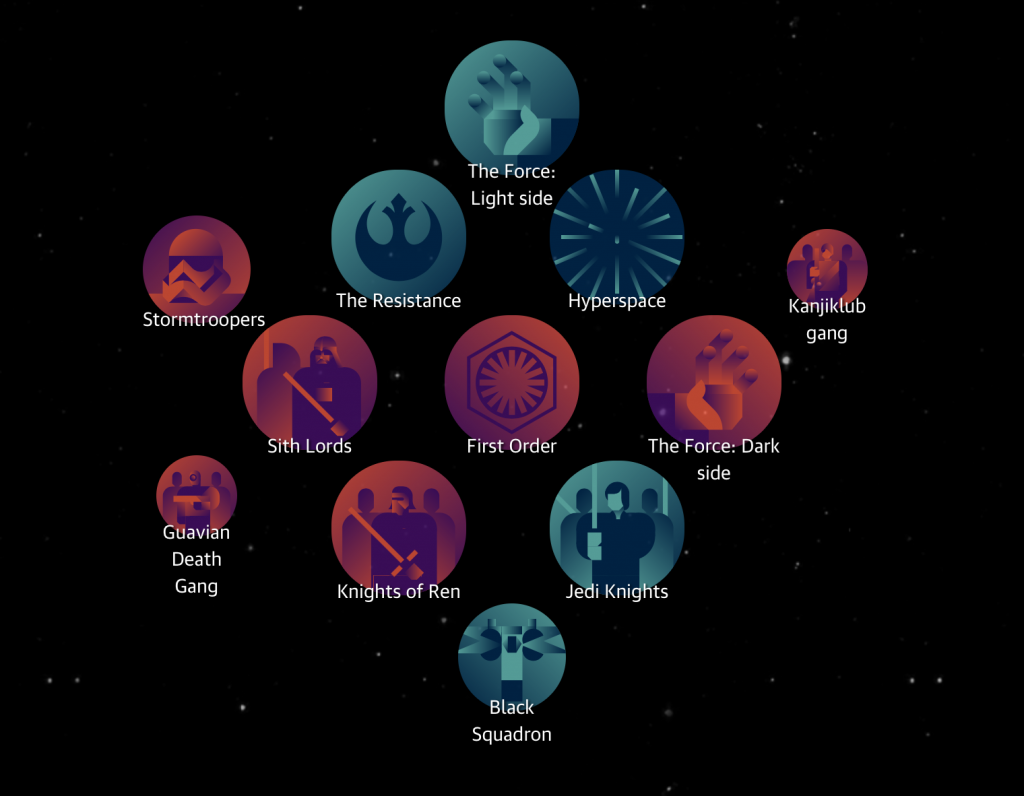
Star Wars: The Force Awakens – your interactive cheat sheet
The Guardian
Interactive Website
As Star Wars fever begins to take hold of the country and the infogr8 office (we have our IMAX tickets booked already), the Guardian have come to the rescue for those not so versed with the lore of the the First Order and the Resistance. This handy guided features the characters, technology and other mythology that you may have missed or forgotten after previous visits to this galaxy far far away, and links them together so we can all claim to be Jedi Masters. We sense greatness in this one.
A Day in the Life of Americans
FlowingData
Interactive module
How does your average day compare to others around you? This simulation of 1,000 people’s daily activities from FlowingData reveals what everyone is getting up to at different times, with dots darting between activities as attention shifts from sleep, to traveling, to eating and leisure. We were surprised how may still find time to sleep well into the late morning, suggesting plenty of students took part in the survey.
Data Blog
During the last 12 months, did you ever find yourself wondering what penny black stamps are, where to find Leavers Lace, or when Eid was? If you did, you were not alone, as thousands of others were all Googling the same thing. That’s right, it’s that time of year again when the worlds largest gateway for knowledge publishes their list of the most searched for queries, relating to celebrities, movies, holiday destinations, and more. Google Trends gives us a peek into what others around the world are curious to explore, so go and see if your search terms were among them.
Bloomberg
Data Blog
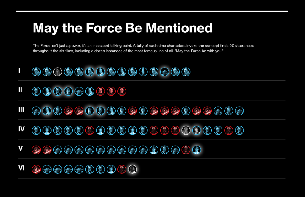
Whether you’re new to Star Wars or a life-long fan, the concept of the Force is probably something you’re aware of. But who is the Force strongest with, you may ask? Well, these guys have watched every minute of the first two trilogies to answer exactly this question.
Impressive, their findings are.
‘A tortured heap of towers’: the London skyline of tomorrow
The Guardian
Scrolling Story
It’s likely that you’ve had a clear view of St Paul’s from places like Hampstead Heath and Alexandra Palace — this isn’t by chance. The Guardian explain, in this fascinating scrolling story, the amount of planning that goes into safeguarding long-distance views. These protected corridors, as they’re called, even go as far as to cut a special hole in a hedge and calculate the curvature of the earth to preserve the view of St Paul’s.
Star Wars says you’re such a kriffing clanker (infographic)
Silicon Republic
Infographic
Seems fitting to have another Star Wars post seeing as the new film is upon us this week. This infographic by Wallpaperdirect showcases the bizarre, yet wonderful Star Wars insults uttered throughout the franchise’s lifespan. I’m liking “Buckethead” for the next person who gets on the wrong side of me! You’ve been warned.
Choosing the right visualzation format
Ceros | Visage
Data Storytelling

Who said data can’t be beautiful and simple? Yes, the process of visualising data can feel overwhelming, but with a few basics by Ceros | Visage, you can turn your data into stories for your audience. Everything can be visualised, it just takes a bit of data crunching and some creativity.
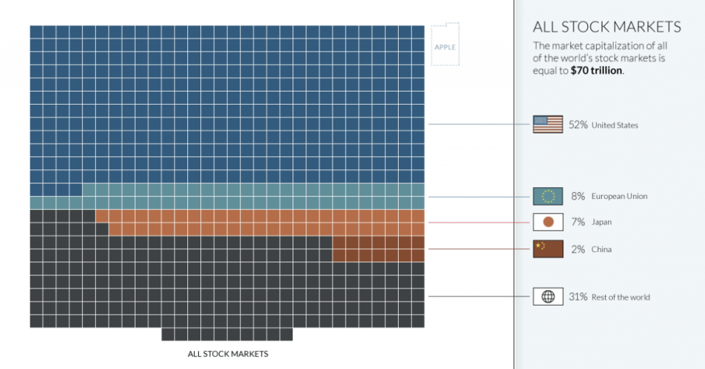
All of the World’s Money and Markets in One Visualization
Financial markets can be complicated to understand. Lots of numbers, percentages, and equations. Yet, seeing all the global debt visualised in small squares with different colour codes seems to bring some order to such complexity — if only it were that easy. These visualisations by The Money Project makes the comparison of large amounts of money from different sectors easy to comprehend.
