 Insight
Nifty Interactive Shows TV Series Ratings by Episode
If you are like me, you probably go to IMDb to check ratings before you commit your time to TV Series bingeing. The site offers several layers of information as it covers everything from cast to storyline. But have you ever wondered which specific episodes triggered the most popularity? Kevin Wu created a very simple interactive to give you the answer.
Graph TV is a nifty tool that lets you dive a little deeper into the data behind every TV episode ranked on IMDb – you can find patterns in the shows quality.
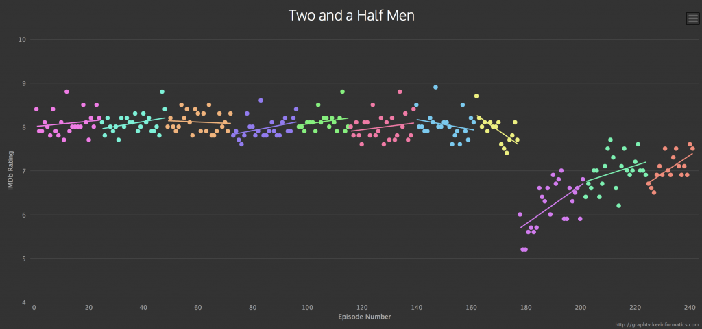
My first inquisitive search started with Two and a Half Men. The results were as I expected – from strong, stable ratings of 8 points on average, the series have dipped since Charlie Sheen was fired with his tiger juice in tow and Ashton Kutcher stepping in as a replacement. The show had taken a different direction, struggling to keep rankings high.
These insights are more expected, we did something similar for BAFTA’s this year with some surprising results, so Leo has some time to go yet before we can truly say #poorLeo 🙂
On the other side of the scale, insanely popular Breaking Bad graphs noticeably show growth in rankings over time. No wonder everyone was saying ‘just continue watching, it’s going to get even better’ However, what truly blew my mind was the fact that ‘Ozymandias’ 14th Episode of Season 5 got a straight 10 with 47695 votes! If that doesn’t reassure your scepticism, it’s not the series. It’s you.
Not only does the tool give a quick snapshot of patterns, data points are clickable to reveal its IMDb entry. Looking for inspiration? Few useful additional features will get you covered: You can scroll down through a nice selection of Every Netflix TV Series and Top 200 TV Shows from IMDb. Dive in film buffs!
Any other interesting variations you’ve spotted? Give us a shout @infogr8!


