Richard Silvester
March 6, 2015
Missing your weekly infographic and data viz fix? Fear not, ICYMI, the infogr8 team have curated some of the best bits we’ve stumbled on this week.
UNESCO Institute for Statistics
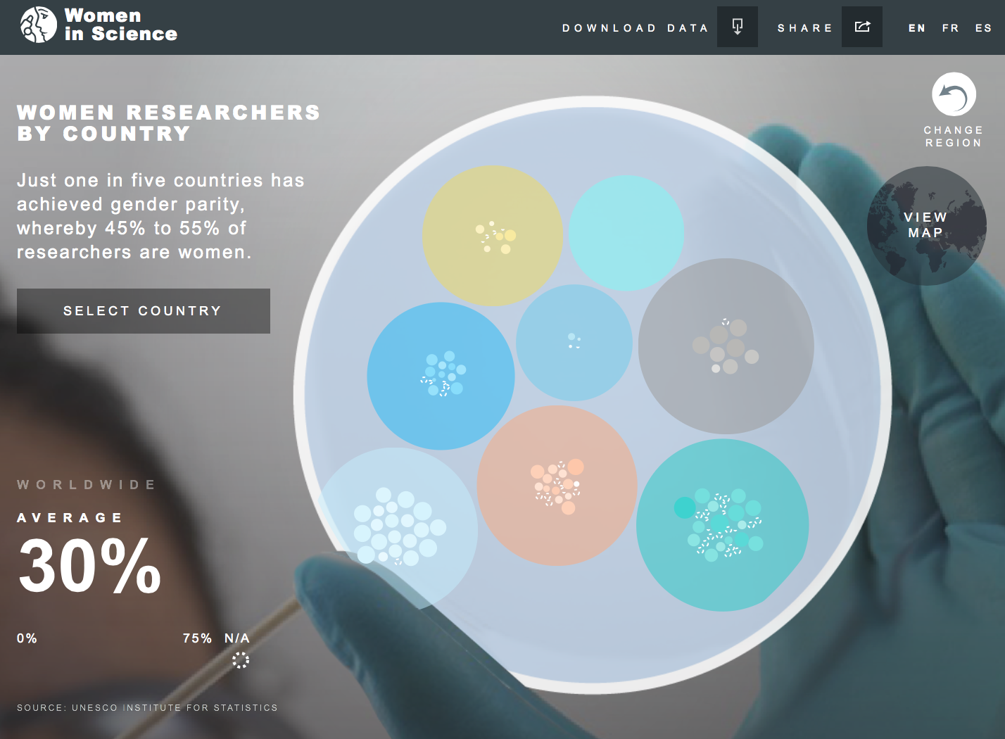
It’s International Women’s day on Sunday! We are going to be honest, the only female scientists we can think of off the top of our heads are fictional characters in the television show The Big Bang Theory. Apparently just one in five countries has achieved gender parity, whereby 45% to 55% of researchers are women. An interactive online app from the UNESCO Institute for Statistics allows us to explore where in the world there is a scarcity of scientists carrying a pair of X chromosomes. In the UK about 1 in 3 scientists are female, but in both France and Germany it’s just 1 in 4. The idea of visualising the figures inside petri dishes is a nice idea, however we are pleased they also included a global map view. It doesn’t take a scientist to work out that the latter option is far easier to use.
trendwatching.com

In our continuous quest to improve ourselves, we have evolved to use advanced methods and techniques. We have stretched this quest even further thanks to technology. The quantified self has become a new movement and data is leading the way. But how can we utilise these technologies to put the user in the heart of data these devices are collecting? Trendwatching.com have put together a slick report on how brands can use technology to analyse human behaviour and get closer to their audience by rewarding this behaviour. Through a myriad of innovative campaigns from leading brands the report tells a story of the ever changing environment of the digital age.
Velerio Pellegrini
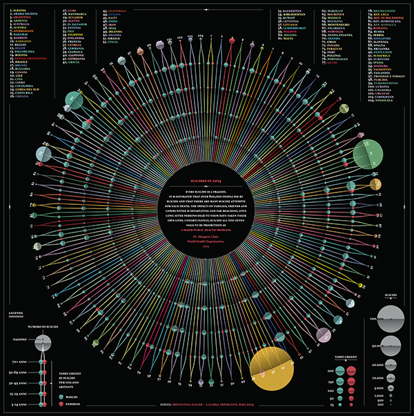
A couple of weeks ago in our ICYMI we featured an infographic on the most common causes of death around the world. This week we found another beautifully crafted visual dealing with tragedy. Valerio Pellegrini has visualised suicide deaths per 100,000 inhabitants from 104 countries in 2014, and has arranged these by age and sex. No particular age group stands out as being most affected, however men appear to outnumber women in all the countries featured. Figures are represented as bubbles scaled by area, it would be great to also see counties ordered by income, or some other factor which would help reveal interesting patterns in the data. We would love to see this recreated as an interactive to help bring the data to life.
Multiple owners
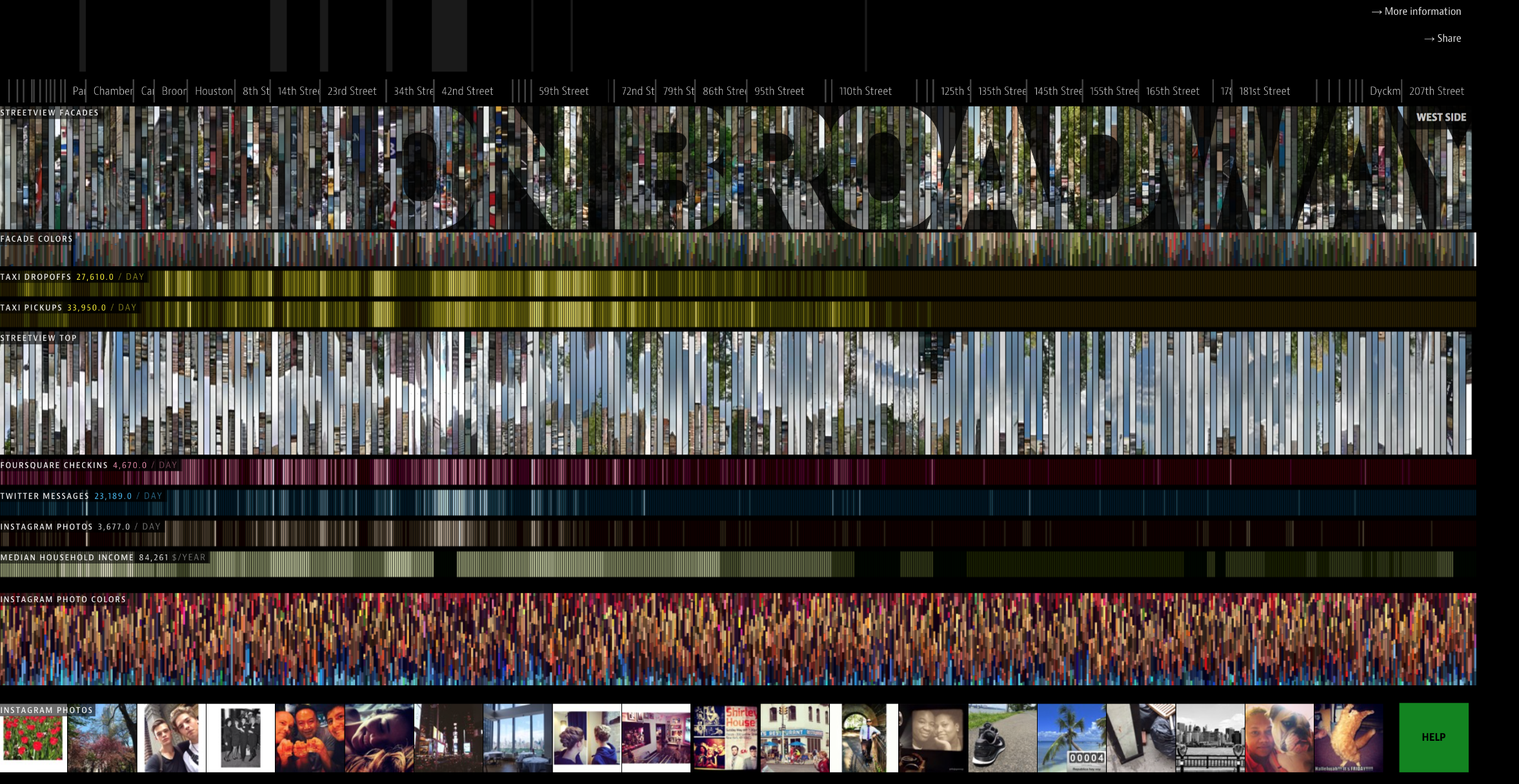
We are so used to to seeing designers resort to maps when profiling certain activities geographically, but ON BROADWAY is a breath of fresh air. This world famous 13 mile stretch running down the middle of Manhattan Island has been visualised using a number of layers including data from social media posts, household income, and taxi activity. This interactive installation has been created by a small group including Moritz Stefaner and will be displayed at the New York Public Library throughout 2015. Alternatively you can explore it from the comfort of your computer as we have done. It’s so immersing that it feels like we’re actually there. Is this a sign of exploration 2.0?
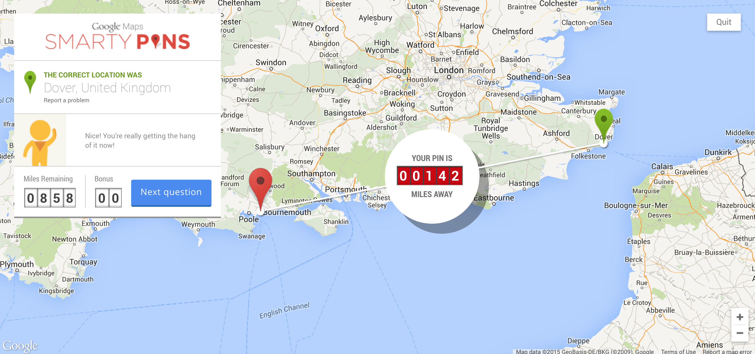
Google maps is possibly one of the most useful tools ever built. The folks at Google took their maps even further with this very special interactive quiz by adding a layer of trivia. Like any quiz, questions are set for you to answer, it’s the gamification element that makes it’s so compelling, as you answer questions by dropping pins into the right location. When wrong, Google maps give you an estimation of how far you are in distance from the right answer. This one certainly held our pinterest, ba-dum tshh!
The Guardian
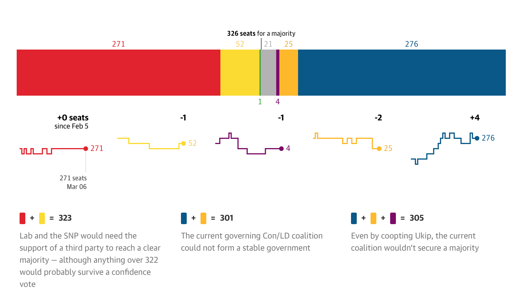
We will no doubt soon be basked in a wealth of maps and charts as the UK prepares for the imminent election process. If they continue to live up to the standard set by The Guardian this week we could be in for a treat. Voting intention since December is shown by combining results from all of the main polling companies, and the projected outcomes are displayed using some rather beautiful Sankey diagrams. With the two largest parties currently separated by just 1% of the predicted votes, it will be very interesting to see which way the outcome will swing come May.
CurrencyFair
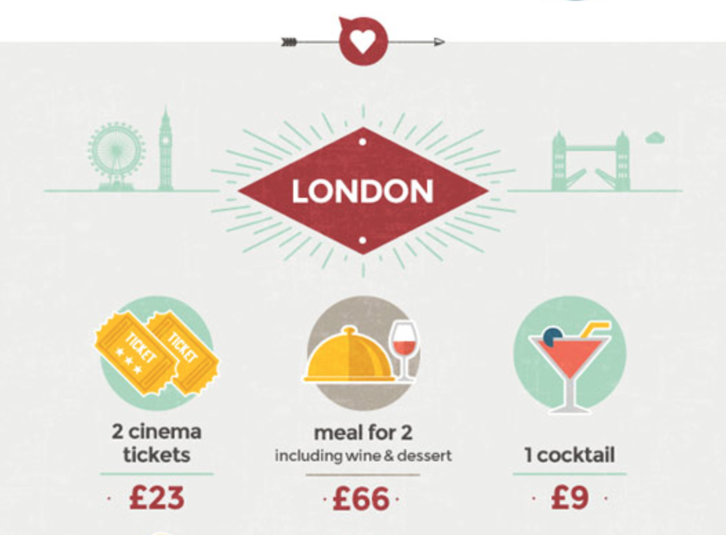
They say you can’t put a price on love, but you certainly can on dating. An infographic courtesy of CurrencyFair has done exactly that, comparing the costs of a evening out across eight cities from around the world. And surprise surprise, London has come out as one of the most expensive. £116 in case you were wondering. Thankfully the infographic also has some money saving tips for each city, particularly useful for those whose hearts are bigger than their wallets.
Mashable

Here at infogr8 we think that sometimes even the simplest of visuals can really help make numbers more comprehendible than the hard facts alone. However it raised a few eyebrows in the office this week to see Mashable using everyday objects to help visualise the average size of a man’s best friend (no, this isn’t the dog and you know it.) Even we are lost for words on this occasion. Take a look for yourself and see if they stand up to scrutiny.
We’ll be sharing more inspiration next Friday, for now you can follow the team on Twitter @infogr8. Please tweet & share your viz spotting stories #vizspotting #ddj
Soho Works White City,
Television Centre,
101 Wood Lane,
London,
W12 7FR