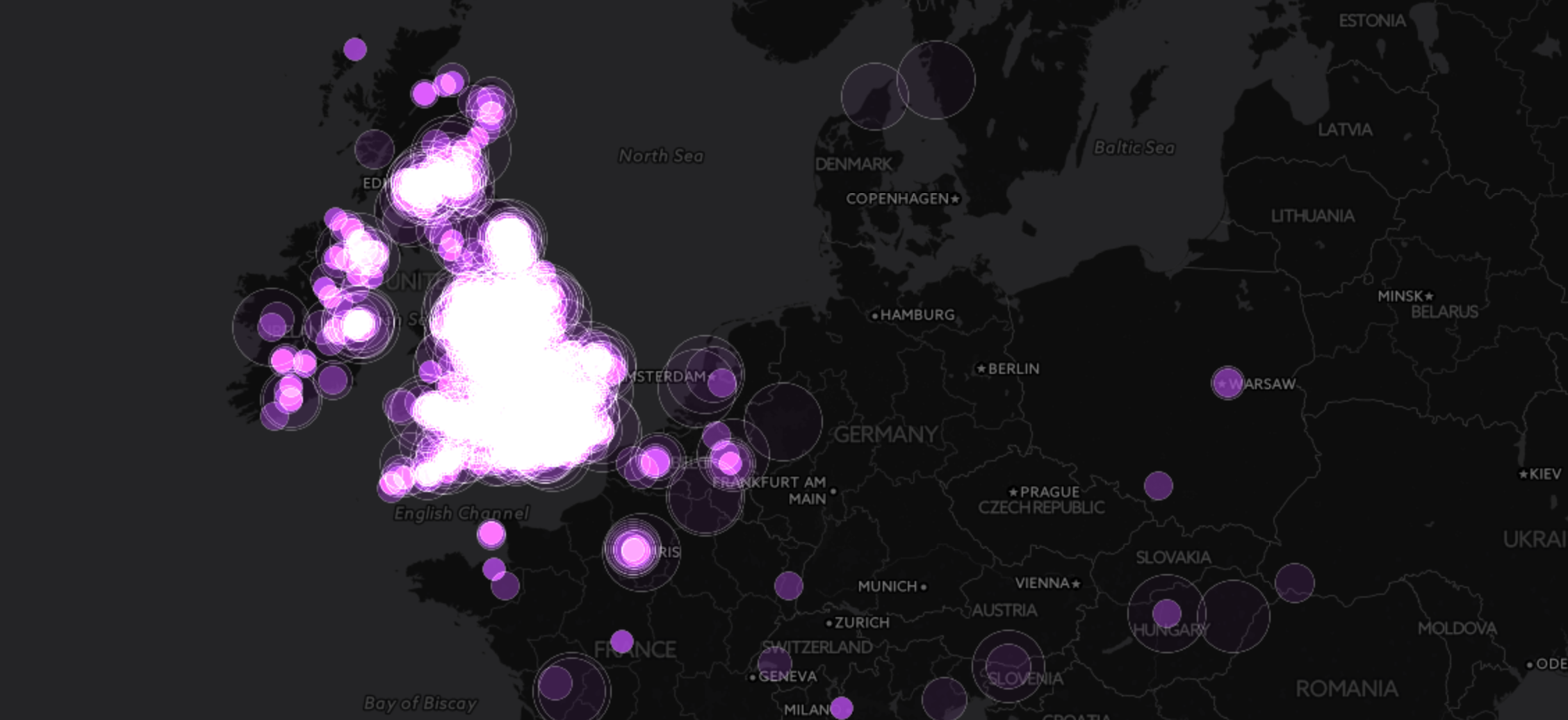
We all had huge expectations from this year’s BRIT Awards as the Queen of Pop was supposed to perform on stage again after two decades and show the rookies how it should be done. What we didn’t expect is for her performance to go viral for all the wrong reasons. Once that Vine was out, there was no going back, as we all gasped in disbelief replaying Madonna’s cape being pulled backwards by one of her dancers resulting in her smashing on the floor. This Twitter interactive captures the social media explosion of this ‘historic’ moment. Have you seen the memes yet?
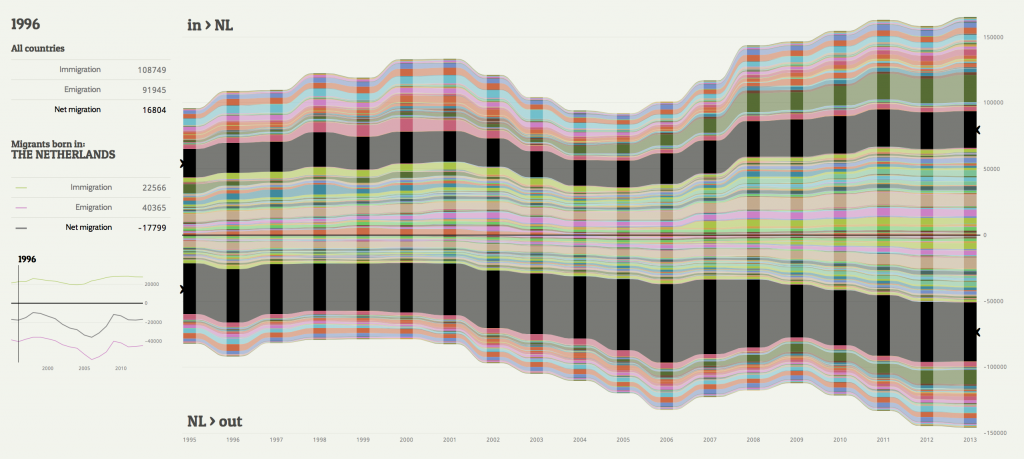
Immigration remains a hot topic for many in the UK, and it appears that those in the Netherlands also have plenty to discuss. Roxana Torre has produced an interactive visualisation that tracks population movement in and out of the country over the last twenty years, and displayed these according to the country of birth. The stacked area chart provides a tantalising overview, however with so many countries featured it is difficult to spot the micro-trends, such as the sudden influx of Bulgarians in 2007. The real insight comes from exploring each country of origin in turn, and hovering over the specific sections reveals a line chart displaying net migration over time. Total population of the country is steadily on the rise despite more Dutch-born people leaving every year, suggesting that the Netherlands is becoming more and more multicultural.
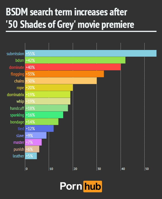
With Fifty Shades of Grey currently dominating the box-office charts, the folks at Pornhub Insights have been kind enough to whip up a few charts revealing what search terms have recently been on the rise across their community. The book has proven to be hugely popular with woman; the movie was bound to have a similar effect, and the statistics don’t lie. Searches for ‘BDSM’ are up 30% among male users, but among woman the increase was a massive 186%, while similar patterns can be seen for other kinky terms such as ‘submission’, ‘bondage’ and ‘spanking’. The data has been collected using Google Analytics, and it would appear that the movie has left female viewers hungry for more.
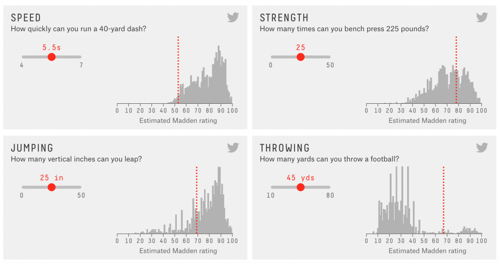
With many of the infogr8 team being longtime video game fans, we remember the days when sports titles featured blocky, generic characters who did not resemble their real life counterparts is any shape or form. As the technology has advanced the on-screen players have become more photo-realistic, but more importantly they play like the stars they’re modelled around. American Football franchise Madden from EA has seen yearly updates released every year over the last 25 years, with each benefitting from the improved processing power of the new systems. FiveThirtyEight recently visited the developers to discuss how stats from real players are incorporated into the game. Each is graded in 43 categories such as speed, strength, jumping and throwing, with additional tags controlling specific behaviours. As players interact with the screen, the outcome is dictated by probabilities, weighted by the various ratings. The game will throw these into a formula and do a dice roll to add some randomness, so it’s Dungeons & Dragons for sports fans!
FiveThirtyEight even created an interactive within the article, allowing us to input our very own stats to see how we compare to the professionals in the current Madden roster.
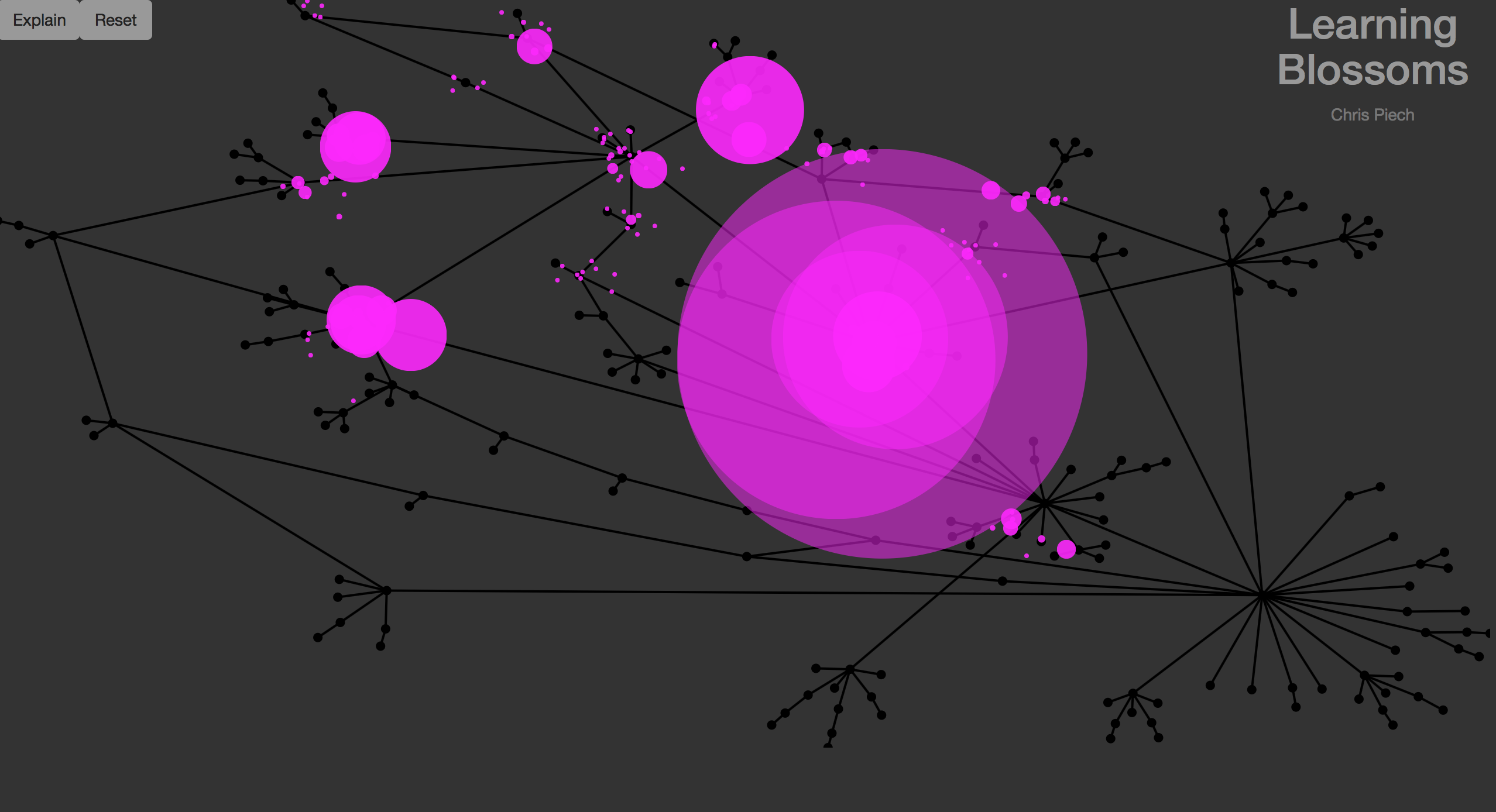
The work of the human brain is a wonderful thing. We sometimes forget the input and process we go through when solving a problem, jumping from solution to solution that brings us closer to the answer. This mesmerising interactive captures exactly that process. Stanford University research gathered data from 509,405 students solving the third challenge in Code.org’s Hour of Code tutorial and then visualised the paths considered when searching for the answer. Feast your eyes with the wonderful data dance they produced.
Online tools like Infogr.am and Tableau have transformed the way users are creating infographics and data visualisations. It’s sometimes easy to forget that one of the best packages is probably lurking in a dusty corner of your hard drive. Well, it’s time to boot-up your copy of Excel because quite frankly it’s awesome. The charts it spits out with the default settings may need a bit of cleaning up, but Cyrille Vincey writing on qunb provides all the tips you need to make interesting and compelling stories. The key message is that less is more, so don’t even think about 3D effects, drop shadows, or any other forms of visual pollution. Remember to be clear first and clever second and that simple is beautiful.
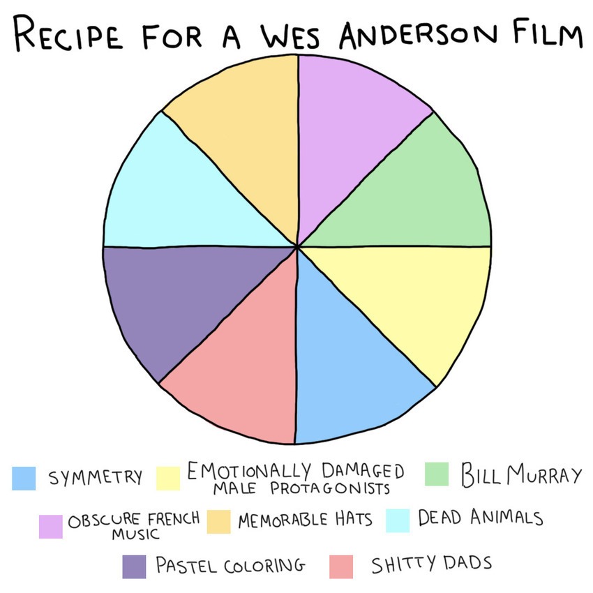
The Oscars are all done and dusted now, but there still lingers the question of watching the films that won. In case you are wondering if the winning titles are worthy, Mashable’s writer and illustrator Max Knoblauch has created few charts and graphs that might help. We must say, that recipe for a Wes Anderson film chart. These types of bitesize infographics are becoming more and more popular as they add a playful element to the visuals, although there is no real accurate data that goes into them, just people’s perception. We must say, that recipe for a Wes Anderson film chart is on point.
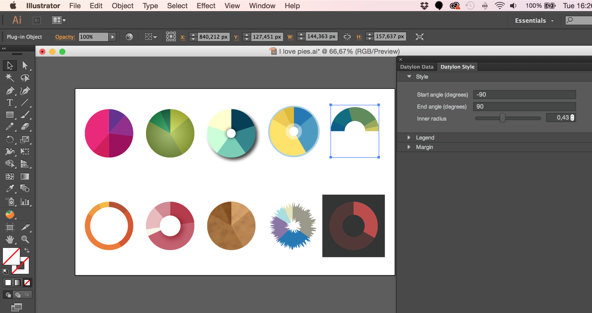
Have you ever been left frustrated and disappointed after using the graph tool in Adobe Illustrator? Well, help may be at hand. Belgium-based startup Datylon has created a plug-in for Creative Cloud users. The plug-in allows Illustrator to work with SVG charts built with javascript, including those built with D3.js, and the Highcharts library, with other sources apparently coming soon. The charts can be visually styled and customised while retaining the ability to modify the data. Amazingly, even once published online, the data can still be amended without the user needing access to Illustrator. We anticipate that this will be an ideal solution for creating periodic reports, and we look forward to trying it out very soon.