Richard Silvester
June 19, 2015
2015 Women’s World Cup Predictions
FiveThirtyEight
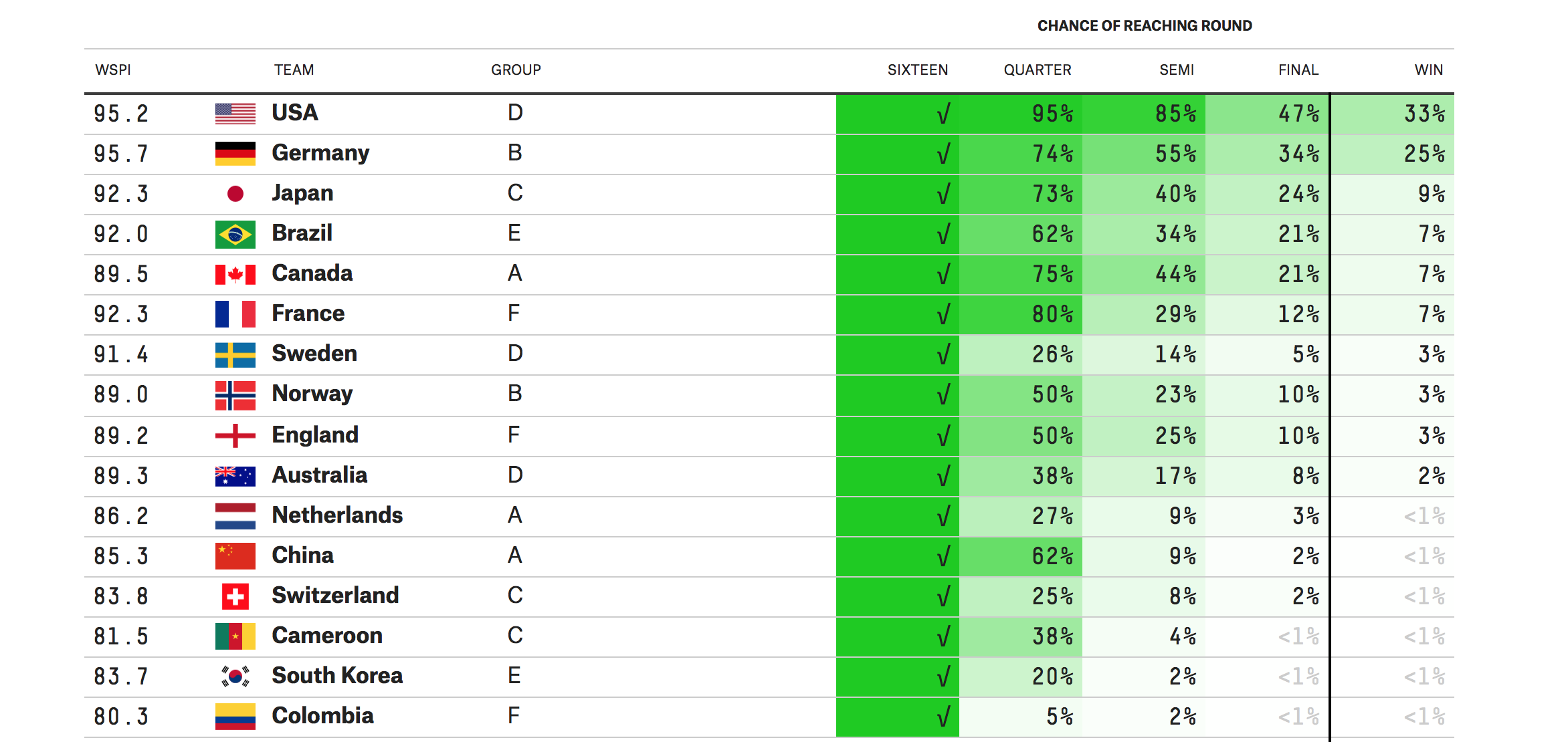
Sepp Blatter may think that woman’s football could be improved if players wear skimpier kits and tighter shorts to promote “a more female aesthetic”, however we could not be happier with the quality of play show during the FIFA Women’s World Cup so far. It’s just a shame that those in charge of scheduling TV coverage in the UK don’t share quite the same passion we do, with games relegated to some of the smaller, lesser known channels. This online tracker from FiveThirtyEight is therefore very welcome indeed, as it not only allows us to catch up with all the results we missed, but it continuously calculates the odds of each team progressing based on previous performance. Although safely through to the last sixteen after handing Croatia an ass whooping on Wednesday night, England have only been given a 50% chance of getting as far as the quarter finals. That sounds oddly familiar. Perhaps the English men’s and woman’s games are not so different after all.
Space Monkeys and Tiger Wine: A Look at Global Animal Trade
National Geographic
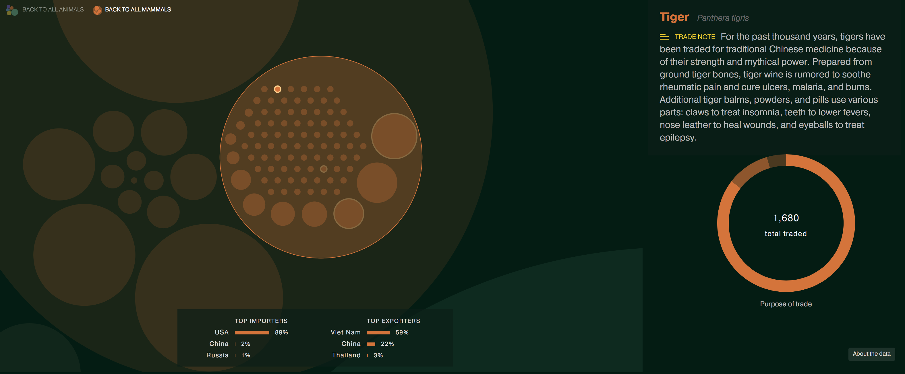
With the current global tiger population estimated to be around just 3,200 we were alarmed to learn that 1,680 of these magnificent creatures were bought and sold around the world in 2013. Even more upsetting is that some of their bones are being ground-up bones and being used to produce ‘tiger wine’. In total, over 34,000 species across 181 countries changed hands, and a new interactive bubble chart form National Geographic highlights the scale of this mammoth problem and allows us to explore not only what animals are being traded, but also who is involved and for what reason. Only some of the species on this list are considered endangered, however unless trade becomes more closely regulated, that situation could change very soon.
The Financial Times
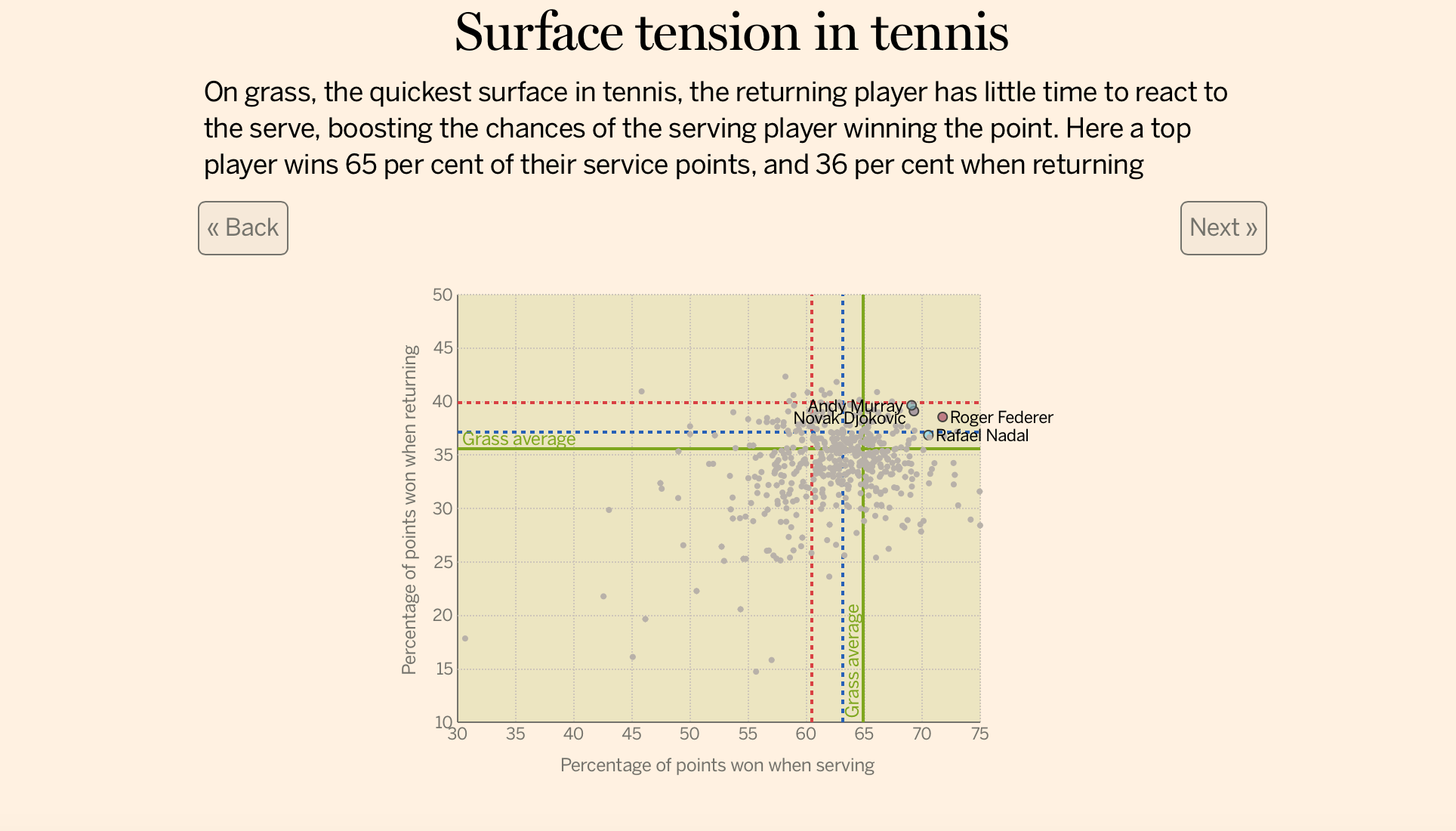
The key to being a Grand Slam tennis champion is to master the game on all surfaces. Rafael Nadal may be nicknamed ‘The King of Clay,’ but he isn’t as ace when it comes to the grass courts of Wimbledon. An interactive scatterplot from The Financial Times shows how the top players from the last 24 years perform on different surface, showing percentage of point won on serve and when returning. By flicking between the courts we can easily see when to expect each of the top players to be on the top of their game. Smashing stuff indeed.
Getting Bees to Construct Geographic Maps
Ren Ri
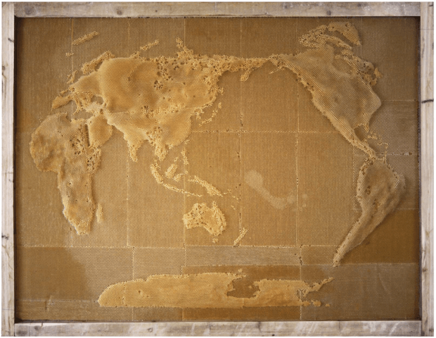
In edition 17 you’ll remember we praised Stamen for their re-skinned Google maps, since then we’ve been busy bees ourselves and stumbled on this sweet little data art piece from artist Ren Ri. Once you read into the story you’ll appreciate the intricacy of how these maps have been created whilst a colony will follow the queen bee and build a hive based on the pheromones that she releases, we wouldn’t like to put a guess on how long this map sculpture took to create but lets just say you wouldn’t want to be the person in charge of carrying the sculpture 🙂 Data art can be a refreshing format for organisations with the desire to inspire in physical spaces whilst getting across the beauty that can be represented via factual data. Let us know what physical spaces you’ve seen that have inspired using data!
Stacking Up the Presidential Fields
The New York Times
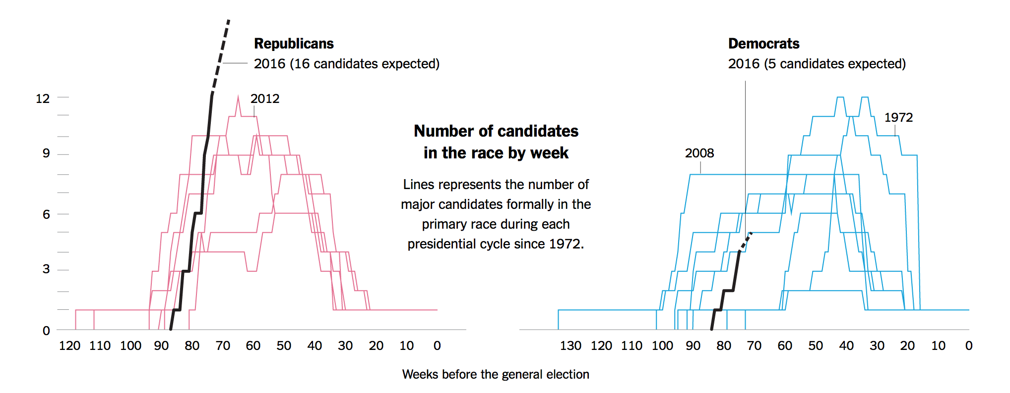
Data fanatics like ourselves have probably noticed that there’s something missing in our lives after the UK general election came to a rather anticlimactic conclusion last month. From the BBC’s interactive game on building your own coalition, to the hilarious explainer video for non-Brits from the Guardian, there was no shortage of election related content to keep us informed and entertained. Lucky we did not have to wait too long for that hole to be filled, because with just 74 weeks to go until the US elects their next president, the New York Times has put together a splendid article tracking the presidential candidates. And there are a lot of them. With Jeb Bush and Donald Trump both throwing their hats into the ring this week, and more expected shortly, the Republican field is expected to grow to a record 16 candidates. Election races from the last few decades are displayed for us to compare, and it is interesting to see the different journeys each candidate took in their mission to control the most powerful nation on Earth.
BBC
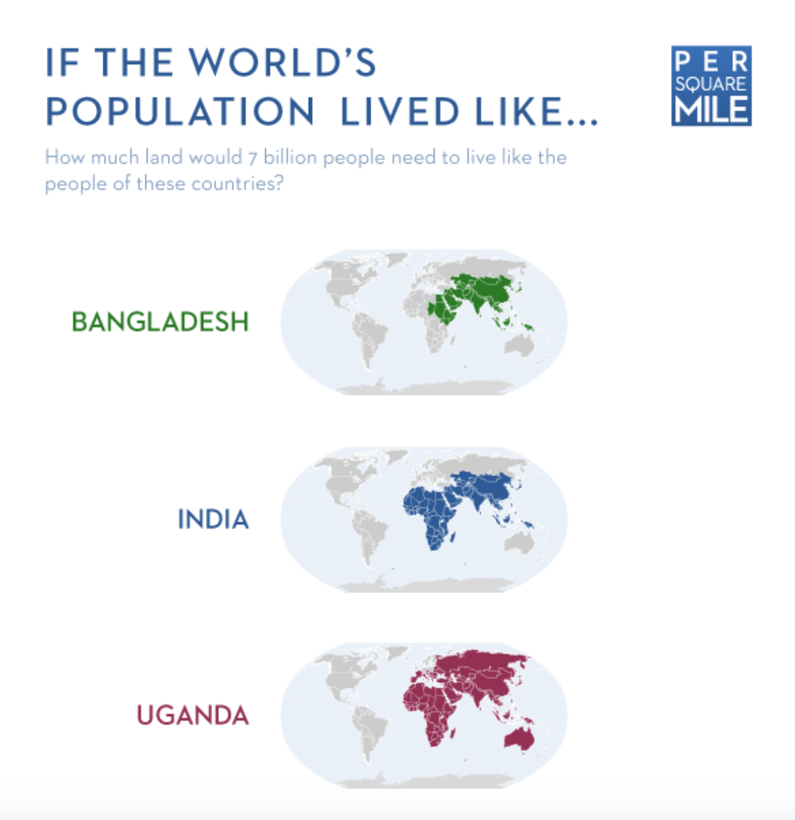
A while back, Tim De Chant treated us to a fantastic infographic which illustrated how much land would be required if seven billion people lived like the populations of nine selected countries from Bangladesh to the United Arab Emirates. We we shocked to learn that if everyone lived as a US citizen, four Earths would be needed to sustain them. This week, the BBC examined ‘ecological footprinting’ in even greater detail, and although the US came out high on the list, others were found to be living even more unsustainably. What’s especially concerning is that the world’s population is currently using not one, but one-and-a-half Earths, suggesting that we are not only living on the edge of what is acceptable, we have already gone well beyond it.
London Underground Map (redesigned)
Jug Cerović
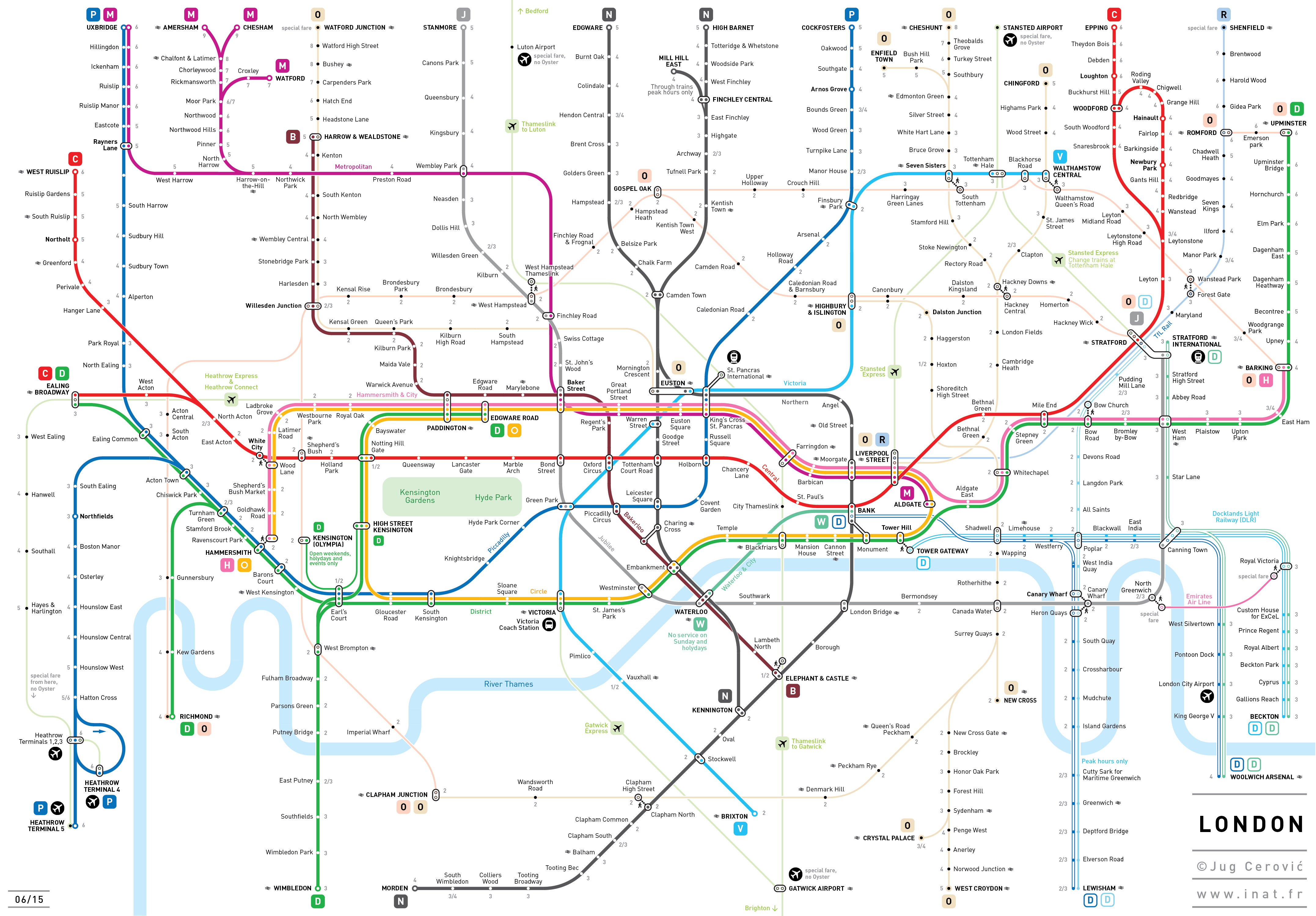
Originally the brainchild of electrical draughtsman Harry Beck, the schematically styled London tube map has been been admired an copied by subway systems across the world. Although beautifully simple back in 1933, the map has continued to evolve to accommodate new lines and services, with modern iterations feeling more cramped than traveling on the trains themselves. TfL’s latest version has certainly struck a nerve with some. If the extra kink in the Central Line at Marble Arch wasn’t bad enough, 28 new Overground stations now swamp whatever was left of the north-east corner. We shudder to think what the reaction will be when Crossrail is introduced in a couple of years. Maybe we have gone beyond the point of sticking plasters, and we need an operation. A fresh start, and a new way to visualise the world’s oldest underground railway. And the internet has risen to the challenge. We were already aware of this alternative design by Hong Kong designer Sameboat which does away with the zone information and correctly displays Out-of-Station-Interchanges but unfortunately neglects wheelchair accessibility of stations. Now, CityMetric has brought another example to our attention. This time, Paris-based architect and designer Jug Cerović, has created a version which is arguably even cleaner and easier to read. Zone 1 has been expanded to give the stations even more room to breath, and it even introduces some overground features such as Hyde Park and Kensington Gardens. With so many options now available, you are all advised to mind the map.
Soho Works White City,
Television Centre,
101 Wood Lane,
London,
W12 7FR