Richard Silvester
May 29, 2015
Omar Ureta
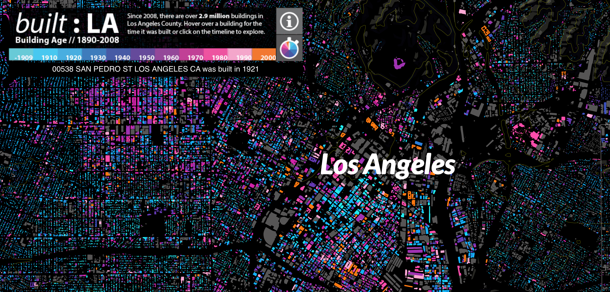
They say that Rome was not built in a day, and the same can certainly be said for Los Angeles. The second-largest city in the United States has a rich history with building old and new making up the landscape. A new interactive map developed by Omar Ureta colour codes roughly 3 million buildings constructed between 1890 and 2008, and allows us to explore the vast web of communities and neighbourhoods. We are even treated to a decade-by-decade time lapse of development across the city, showing which areas were rife with development at different periods. It would appear that the building across the City of Angels are as mixed and diverse as the people who live within them.
Zeit Online
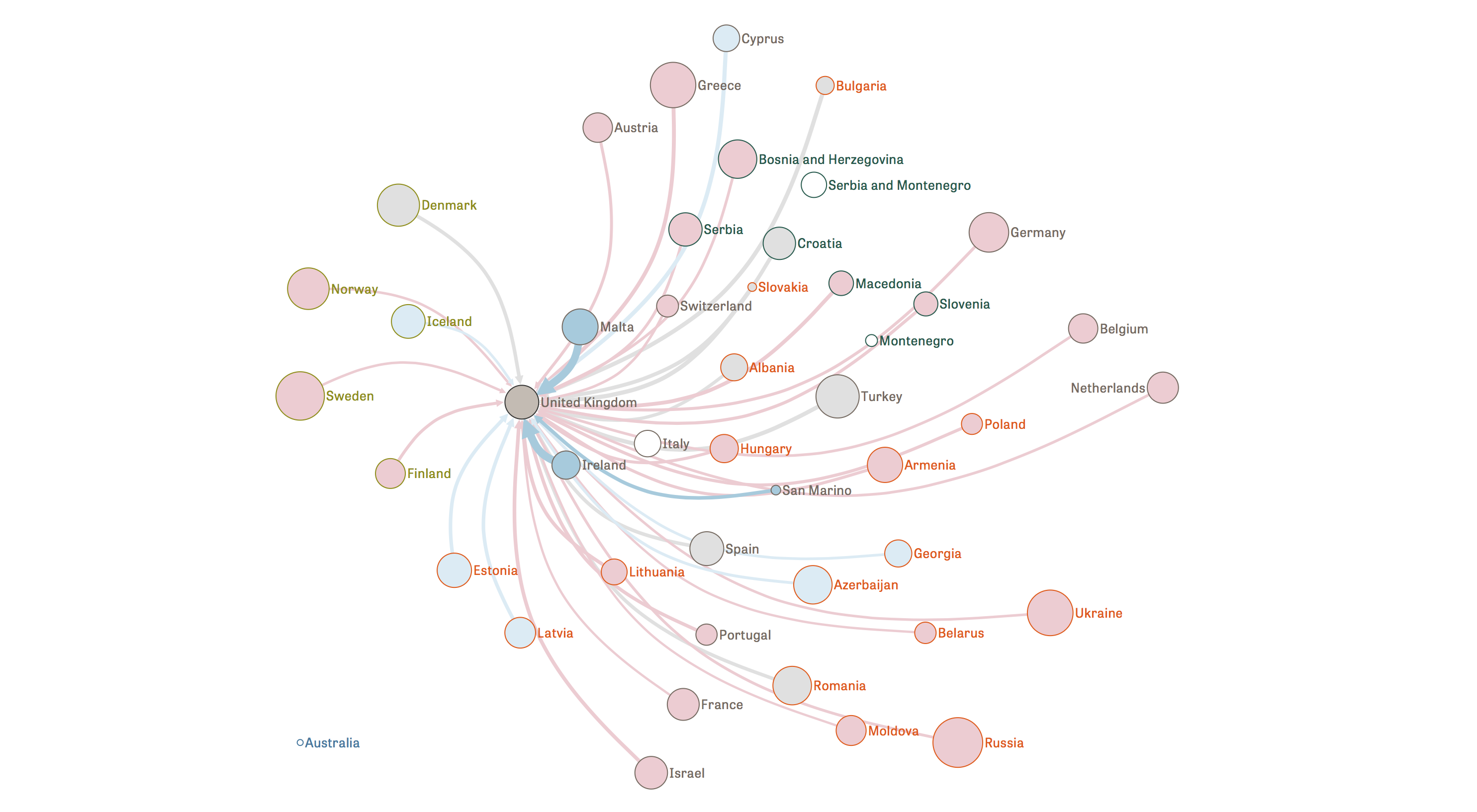
We are still reeling from the shock of yet another abysmal performance from the United Kingdom at this year’s Eurovision song contest. Perhaps we should not be so surprised. Everyone knows that certain countries tend to clump together and vote for each other regardless of song choice, and this interactive flow diagram from Zeit Online makes it easy to identify the culprits. Some of the biggest offenders are those sly, devious countries that once made up Yugoslavia, each awarding their neighbours with those elusive points with no love for the UK’s Electro Velvet. The only countries to award the United Kingdom points in 2015 were Malta, San Marino, and Ireland, all of which are identified in the diagram as tending to favour the UK based on previous performances.
Neil Halloran

Many who are alive today will find it difficult to comprehend how many lost their lives during the harrowing period of the second World War. This interactive documentary from Neil Halloran manages to open our eyes by revealing the numbers in a way that can not fail to shock and amaze. What’s really impressive is that the video pauses at key moments and allows the user to hover over the charts to explore details in more depth. Of course, we hope the world will never see conflict on this scale ever again, however we are very excited to see this new hybrid between storytelling and interactive visualisation develop in future.
South China Morning Post
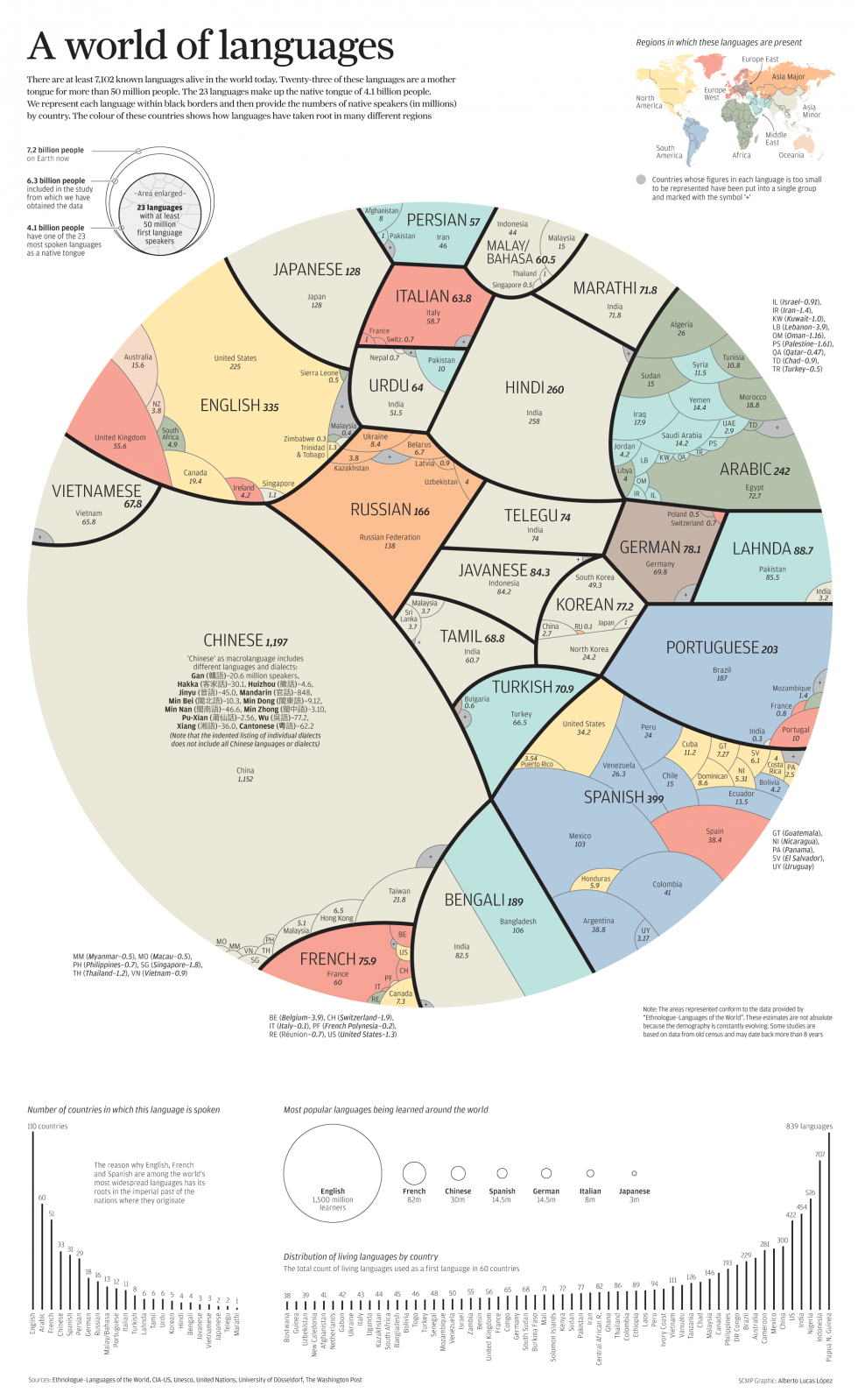
It would appear that English speaking folk are well and truly outnumbered when we examine the most commonly spoken languages across the world. An infographic from the South China Morning Post shows the 23 most common natively spoken tongues and where users are located. The tree diagram structure reminds us of those produced by Information Is Beautiful, such as this piece comparing large sums of money nestled within different categories, but the circular arrangement used here definitely makes for an interesting reading experience. English is certainly the most popular language current being learned, but to become the most popular it has a lot of catching up to do.
298 Data Visualisation Sources
Andy Kirk
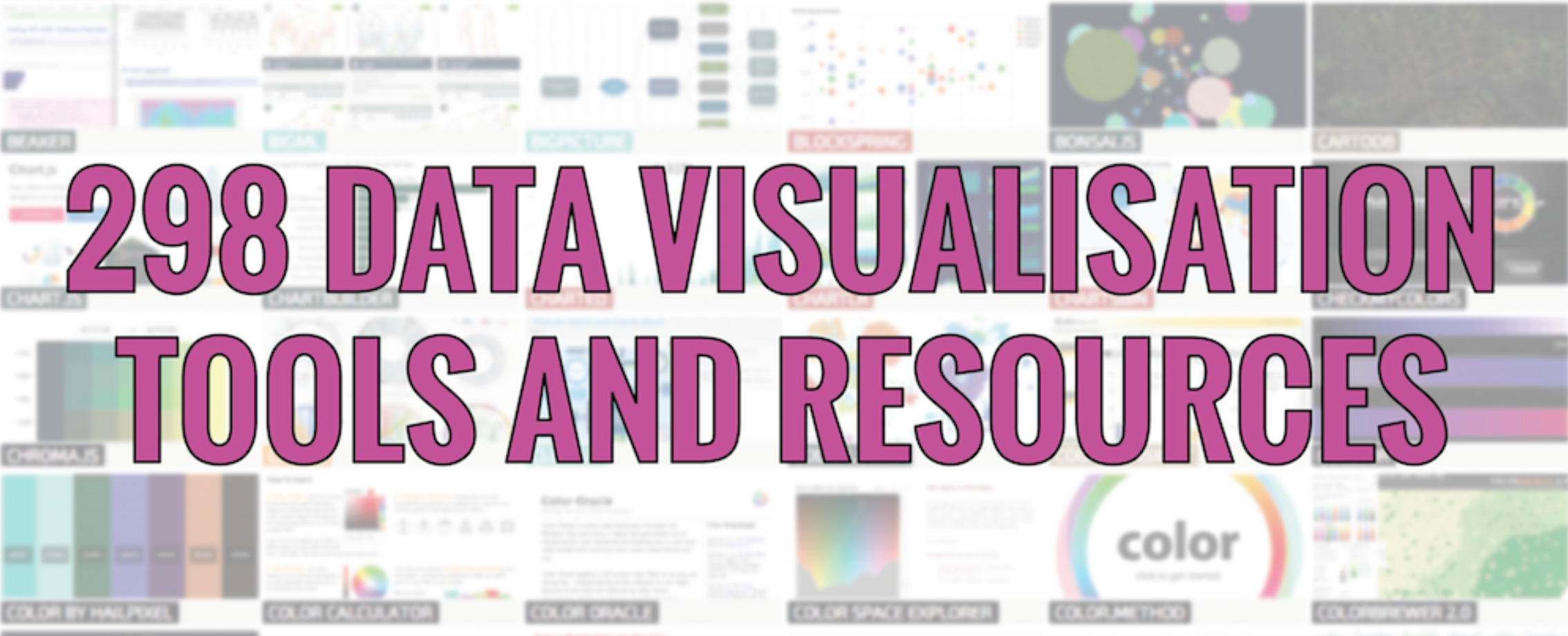
With so many online tools available to create stunning data visualisations it can be difficult to know where to start. Luckily our friend Andy Kirk has collated almost 300 of the best resources out there that should help make all of our lives just that little but easier. We can even filter resources to find exactly what we are looking for, so next time you want charting, mapping or programming help, you will know exactly where to look.
Healthy Access
Toothpick
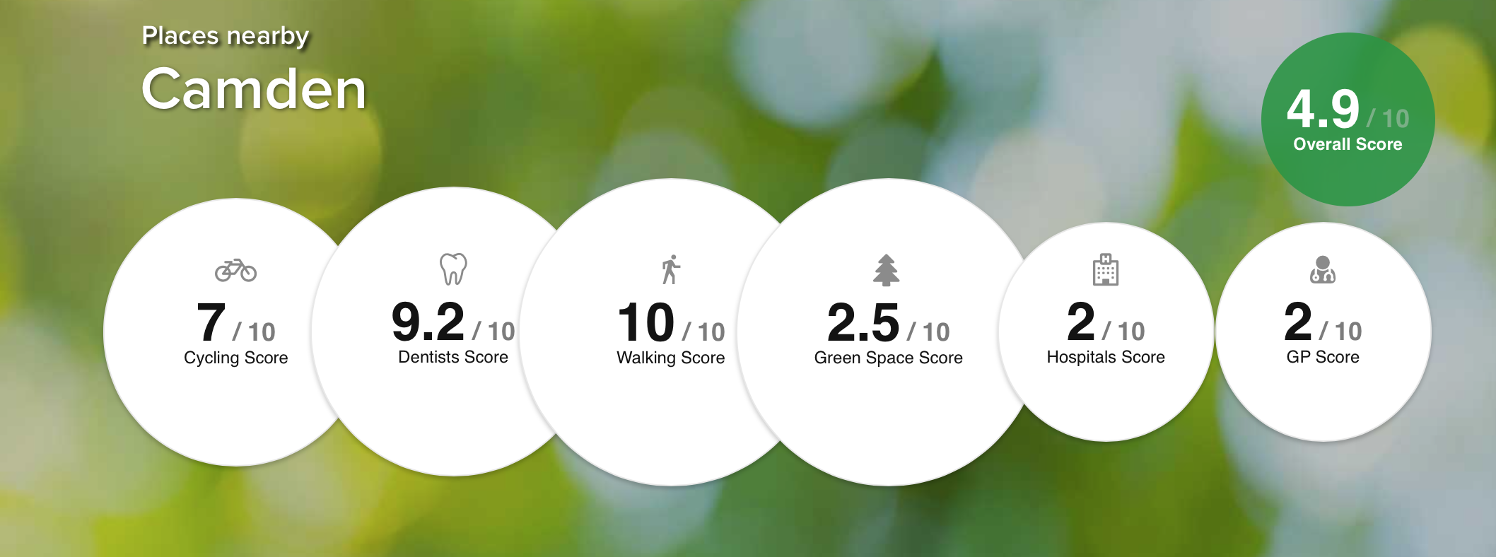
We are all on a mission to stay healthy, but this can be more difficult for some than it is for others. This is partly due to the area we live in, as different local authorities have varying levels of quality of services such as hospitals and dentists. Some also offer better cycling and walking routes, as well as more green space, making comparisons tricky. Luckily the guys at Toothpick have devised a rather ingenious scoring system and plotted the results onto a choropleth map for us to compare UK regions. Hopefully this will encourage those areas lagging behind to ensure they are offering their residents the provisions needed to lead a health life.
Fourquare & Mapbox
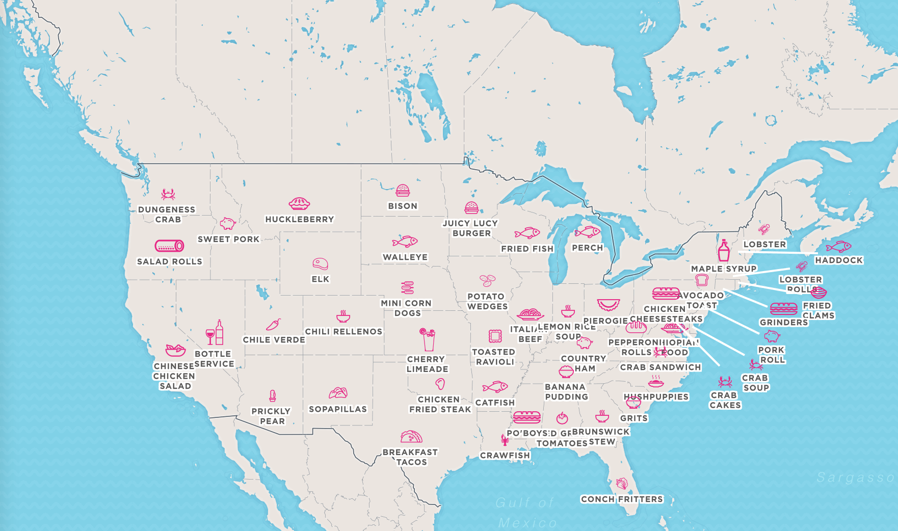
Everyone here at infogr8 shares a love for traveling and good food, so we were all extremely excited when we discovered this tasty morsel curiosity of Foursquare and Mapbox showing the most popular dishes per US state. We are even told the best places to visit to sample these culinary delights, leaving us salivating at the very prospect of a road trip.
Periodic Table of Content Marketing
Econsultancy
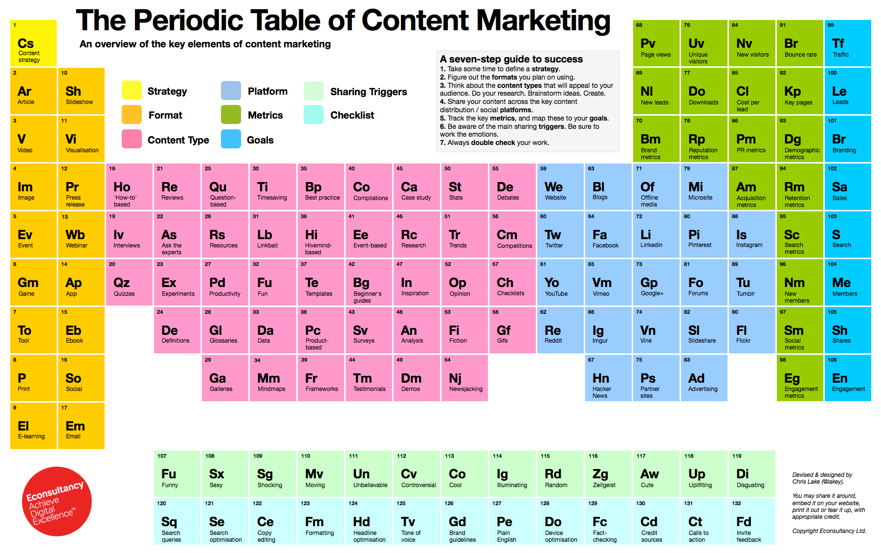
A beast in itself content marketing is not going anywhere anytime soon. Whether you are a novice struggling to get your head around it or you are an advanced “guru”, searching for the next best strategy, this Periodic Table from Econsultancy is an extremely helpful guide to content marketing. We’d say it’s definitely a fascinating keeper item, maybe even poster worthy. 😉
Soho Works White City,
Television Centre,
101 Wood Lane,
London,
W12 7FR