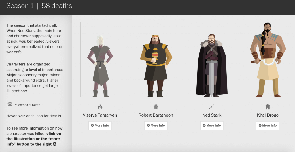
Only 3 days till the new Game of Thrones season kicks off and we wrap ourselves into the magic of fire-breathing dragons while we turn into wildlings, living only for the next episode. Let’s face it, it’s been a long wait people. It’s exciting and daunting in the same time. We are all set this weekend for a 5 episode marathon to refresh our memories for the premiere on Monday, but in case you don’t have the time for binging, this sleek interactive will bring back all those horrifying moments George R.R Martin loves to throw at us. The team at The Washington Post have patiently gone through every single death that happened in the epic series, even pigeons. We are not joking, it’s all there, neatly illustrated with additional info included on how each death appeared. Valar Morghulis, indeed!
Interesting stories are sometimes revealed when multiple complex datasets are overlaid and compared, and yet London-based designer, Michael Pecirno has proven that sometimes a simple approach can also lead to remarkable results. Each piece from his most recent project, Minimal Maps, uses a single dataset to highlight various features across the US. When this stunning range of work is examined as a set, they revel the shape of America in beautiful and unexpected ways.
We came across AprilZero few months back and we were very impressed. Software developer Anand Sharma created a platform to track not only his fitness activity via tracking apps and wearables, but connect his social media and make sense of everything he does online and offline. Now he is bringing AprilZero to the masses. Gyroscope will combine your data and tell a story about you. It’s versatile and there are many apps you can integrate; Foursquare, Jawbone UP, Fitbit, Twitter, Instagram are just a few. The UX is sleek and modern with a Minority Report look and feel. We can’t wait for this one to be released!
When Buddy Clark’s cover of Jack Lawrence’s song “Linda” toped the charts in 1947, Linda overtook Mary as the most popular name for newly born girls that year. This infographic video from Abacaba highlights this and similar naming trends across the US since 1880, and how these marry with various cultural events from the time. We feel an interactive web app would allow us to explore these more easily, however this is still a intriguing overview of how historical events have helped name us through the generations.
The seven-way televised election debate really put a cat amongst the pigeons the other night, and proved if anything that when it comes to electing leaders we have almost too much choice in the UK. Thankfully, Unlock Democracy have made our decision somewhat easier by providing us with Vote Match, an interactive tool which recommends a political party using a quiz-style questionnaire. Even if you have already decided who to vote for in May, it would be interesting to see if you are planning to back the right horse, based on your own policy preferences.
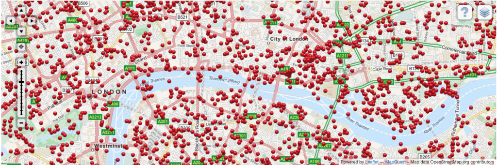
Memories of World War 2 still linger strongly among many who lived through the experience, but the scars left on London landmarks have healed remarkably well. This interactive map from the University of Portsmouth proves how much of a pummelling our capital took during the Blitz by documenting bombs dropped during this terrible period. Modern day Londoners will probably find that there was an explosion not far from where they live or work, leaving us to ponder how lucky we would have been if we were alive just a few decades earlier.
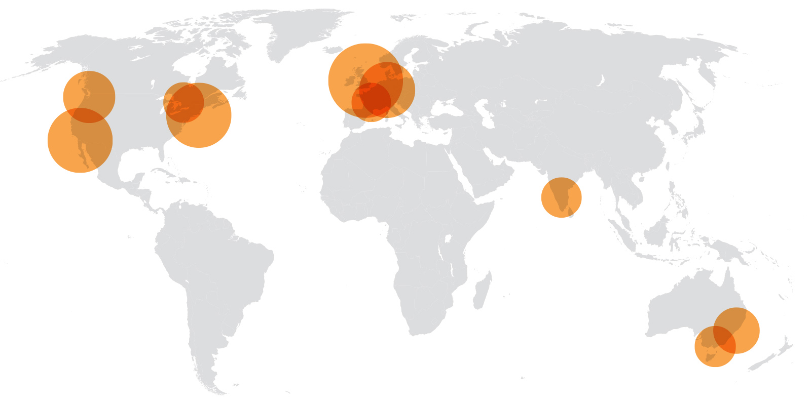
We’re sure many of you will be familiar with Stack Overflow, a Q&A platform for coders, with 3.5 million users worldwide. VentureBeat recently crunched the numbers to discover where in the world you are most likely to find top programmer talent. And the winner is… London! Our home city trounced all others, with more users than New York, San Francisco, Seattle or anywhere else for that matter. The UK as a whole also preformed exceptionally well when we consider the number of users on a per capita basis, however no-one can challenge the might of Sweden or New Zealand it seems. Our team at infogr8 were intrigued by the findings and decided to rustle up a quick map to show where global developer talent is most likely to be found.
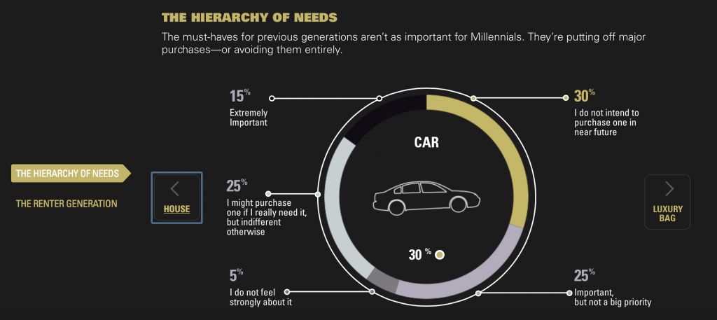
Millennials have always been a sticky topic for marketers, as it is known as the first generation that shaped the digital world we lived in today. Goldman Sachs have packaged up a data story to depict millennials behaviours, the reasoning behind it and how these trends will shape the Millennial economy. It’s interesting to see the comparison with Baby boomers and Generation X in shopping habits and how the power of social is affecting the way brands are perceived online. A generation that lives online, shops online, forcing businesses to change there methods for decades to come.