Richard Silvester
November 27, 2015
This week, we continue on our quest to pick and choose the most interesting content in the IIB awards that makes our team at infogr8 tick, this time diving into interactives..
Ben’s picks
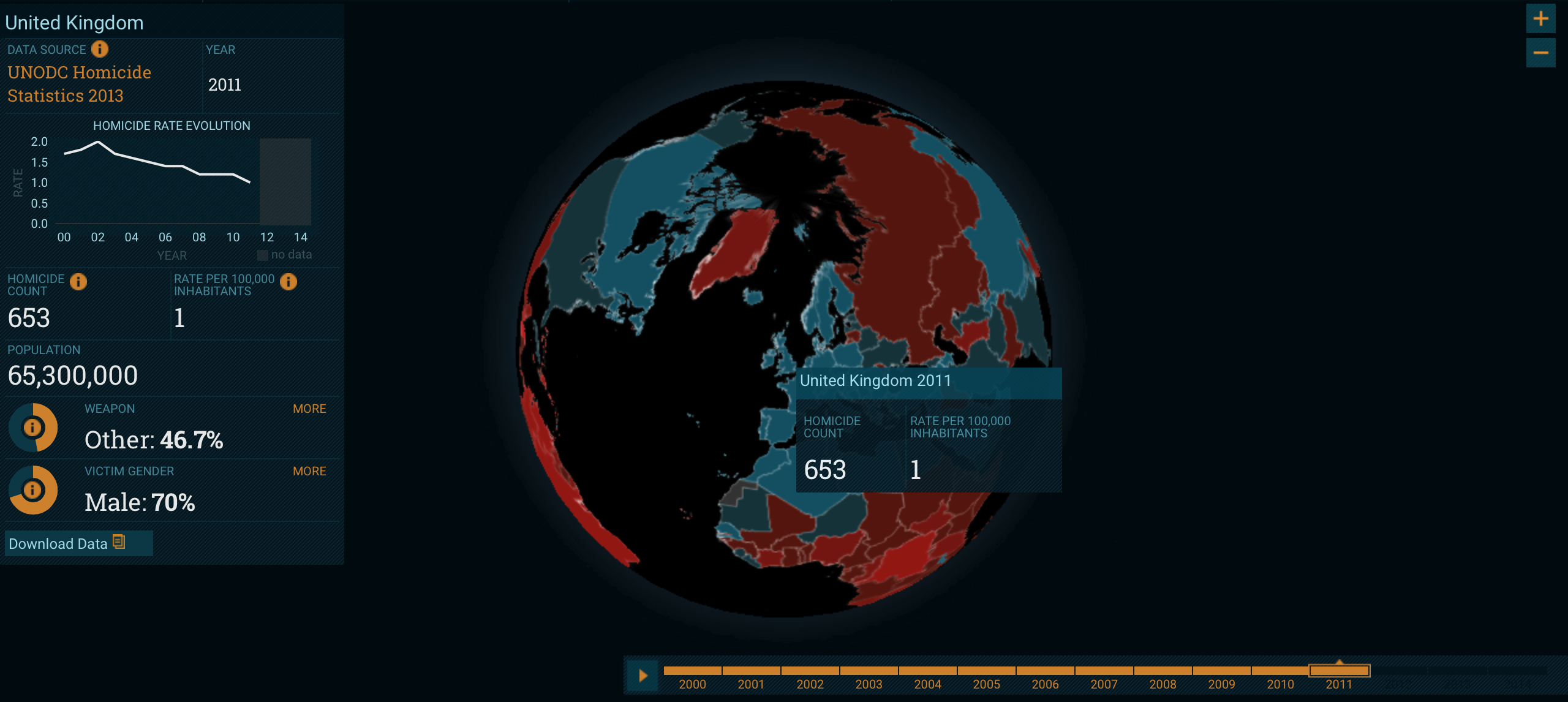
Igarapé Institute
Aaron’s picks
IIB Studio
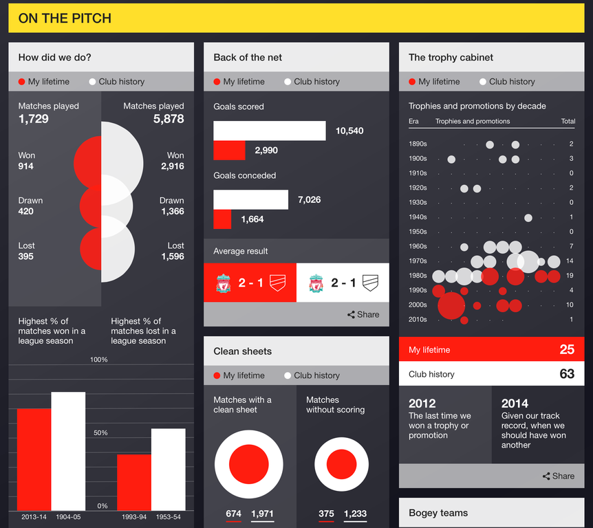 Many of today’s top football teams have an extensive history stretching way back before our year of birth. Have you ever wondered how your favourite team fared before you were around, or how successful they have been since you begin supporting them? A personalised dynamic dashboard by IIB Studio for BBC Sport allows us to see match success, total crowd attendance, trophies won and much more across the history of the club, as well as in the years we have been alive. We originally featured this in Vol 29 of our ICYMI. There’s enough data in here for even the largest football trivia fanatics to go head over heels for, while the clean, simple charts allow even non fans to get a kick out of the information on display.
F1 standings track statistics race calendar
Reuters
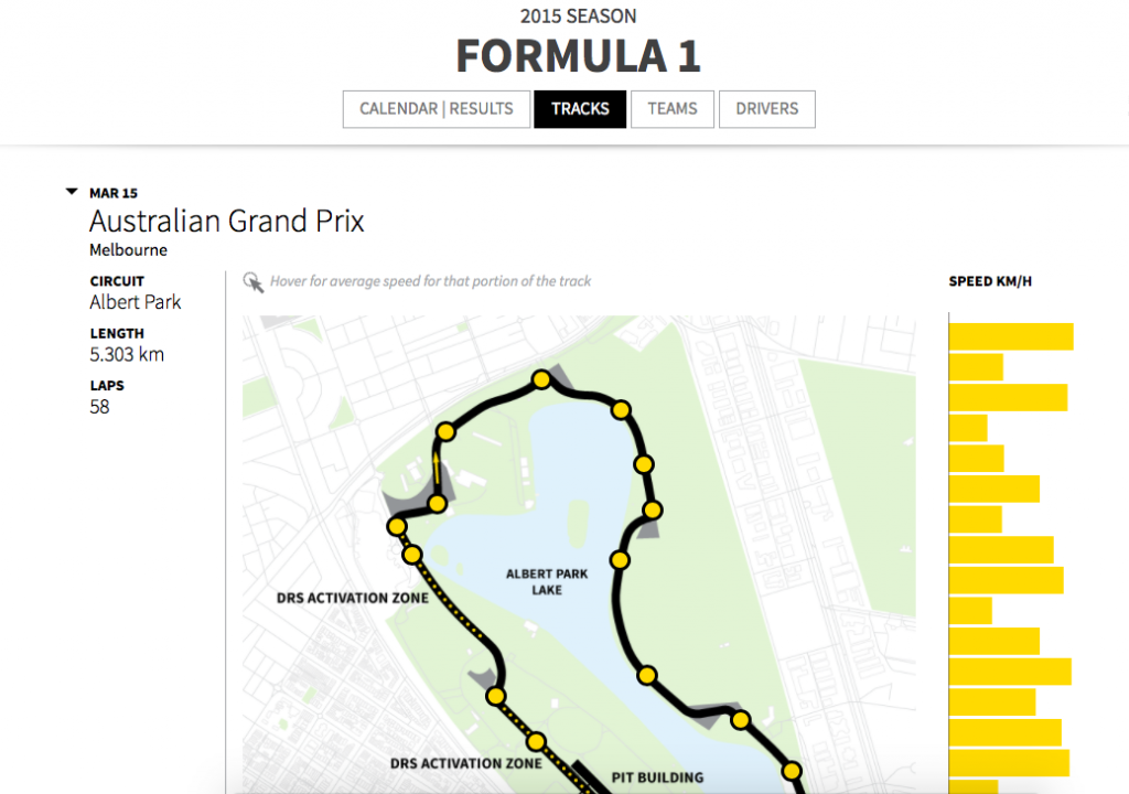 There’s more than one F1 super fan data nerd here in the infogr8 studio, which is why we recently decided it examine deaths across the history of the sport in our static data visualisation, End of the Road. Naturally then, we are also big fans of this piece. Reuters have developed this clean, functional microsite presenting the drivers, the team standings and circuits with plenty of statistics to drill down on. We raved about this last month in Vol 37 of our ICYMI. As a further iteration, we’d love to be able to compare the track speeds across one visual but for a top level overview this takes pole position.
David’s picks
The Counted – People killed by police in the US
The Guardian
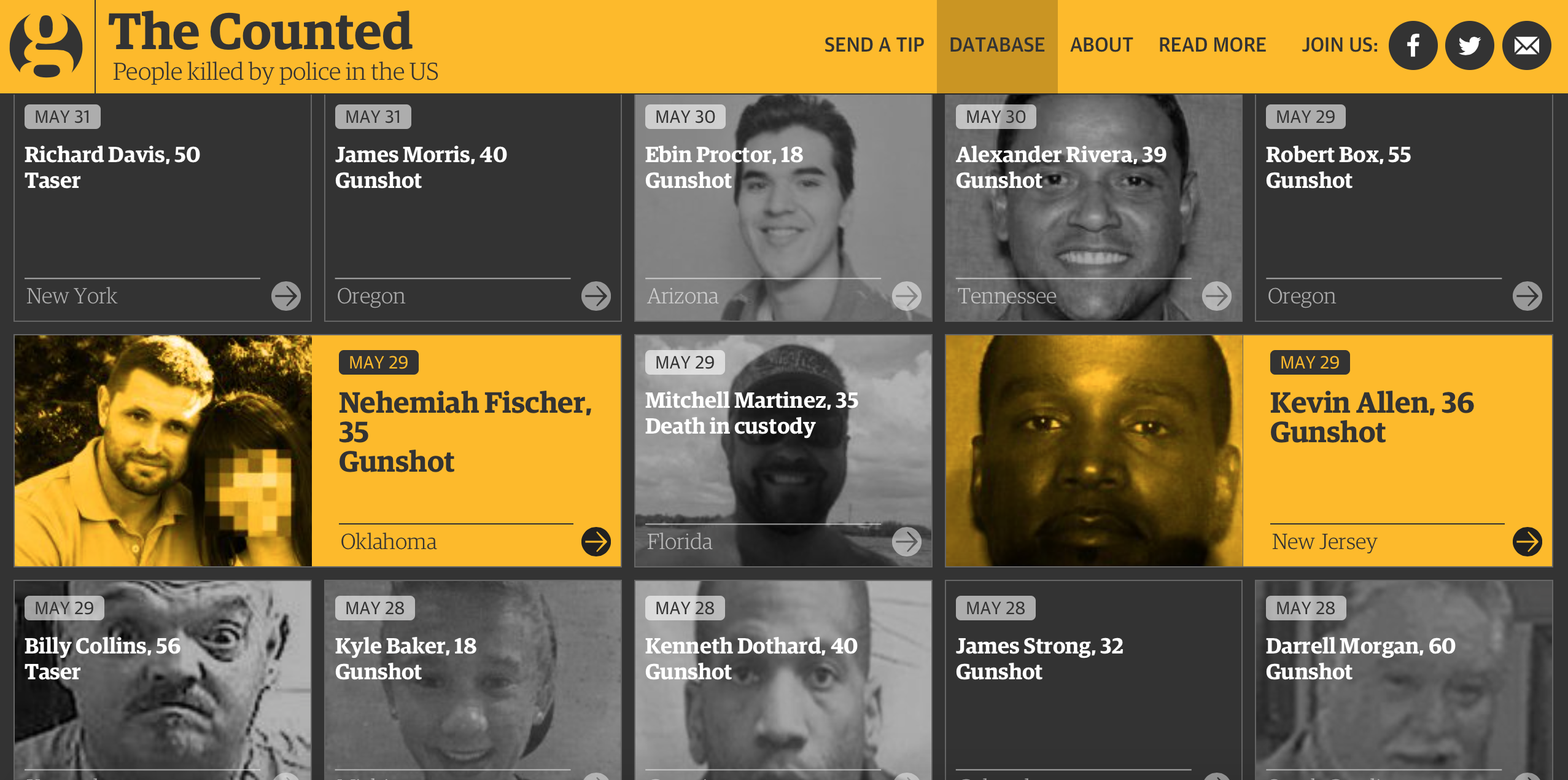
Back in Vol 20 of our ICYMI we learned that there have been more fatal police shootings in the the US during the first 24 days of this year, than England and Wales has seen in the last 24 years. The Guardian have decided to get right to the heart of this issue and has created an interactive database of all those who lost their lives to police officer intervention throughout 2015. The stunning use of photography and personal stories behind each case really took our breath away, making this more impactful than statistics alone could ever manage.
The True Size of Countries on the Mercator Map Projection
James Talmage, Damon Maneice

It all started with The True Size of Africa map, and since then there have been much discussion over the relative size of various countries against other land masses. Misconceptions are due to the Mercator Projection, a method of visualising the Earth’s spherical service onto a flat plane. This greatly distorts and exaggerates the size of countries away from the Equator, leaving us with an inaccurate impression when we view maps in textbooks. Well, with the magic of technology we can hopefully put all discussions to rest. We originally discovered this data driven website from James Talmage and Damon Manic back in ICYMI Vol 34 and we loved how allows us to simply pick up any country and place it next to another, while automatically scaling the size to allow for accurate comparisons. Greenland is often portrayed as a humungous land mass close to the North Poll, but move it closer to the equator and you’ll see that it’s just taking the pie.
Maria’s picks
Airbnb
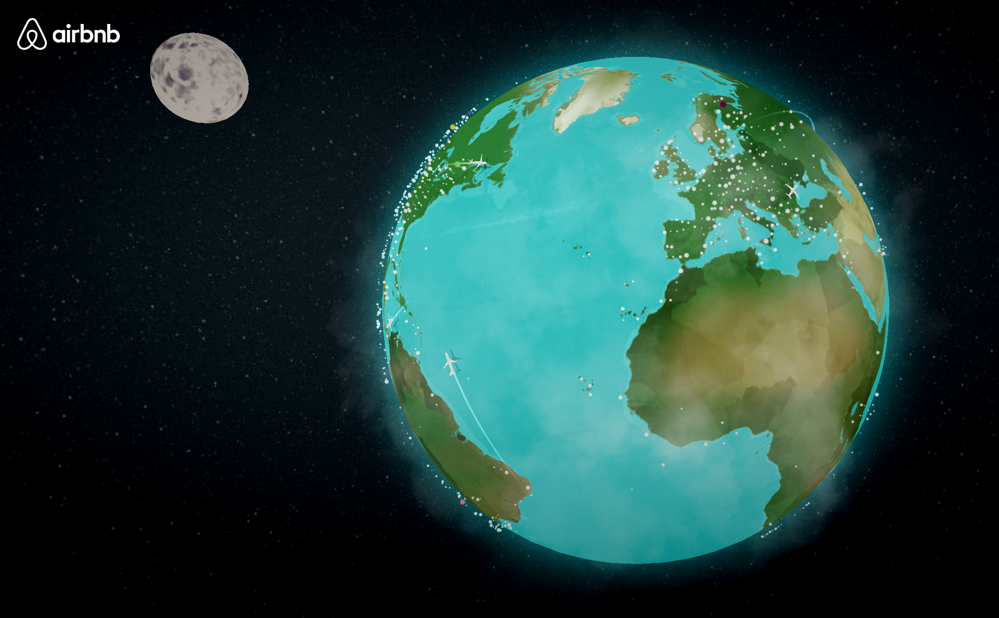
It has often been commented that information technology has helped make the world feel smaller. Of course Airbnb are keen for us to explore as much of it as possible, and their #OneLessStranger campaign featured in one of our first ICYMI – Vol 2, is intended to help potential travellers feel that they will be made to feel welcome in their new surroundings, wherever they decide to travel.
A World of Belonging, an online interactive globe, is the next step they have taken to help make strange and foreign lands feel more friendly and inviting. The charming illustrations alone are reason enough to traverse every inch of this virtual landscape, however we may also uncover a number of Airbnb related stats along the way and view what is apparently real-time traveling and checking-in data from their users. Tweets using the #OneLessStranger hashtag have also been woven into the mix, helping to expand the awareness of this campaign and show where on Earth Airbnb users are sharing acts of kindness to make their guests feel more at home.
As much as we adore the the artistic style and soothing tones, we can’t help but feel a little curious about the ‘real-time’ aspect of the data that is on display. However, we are hopeful that more will continue to be integrated soon so that we all have reason to visit this beautiful piece again and again.
Histography
Matan Stauber
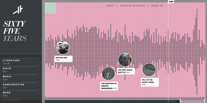
What would Wikipedia entries look like if they were displayed as individual blips along a single, 14 billion year timeline? Matan Stauber obviously asked himself the same thing, and to find out he has created Histography, an interactive timeline mentioned in our ICYMI Vol 38, that plots key moments from the birth of the Universe, up to the Google developed driverless cars. What really stroke me was the execution of the project whilst dealing with large sets of data and still being presented in a visually mesmerising way. We can even categorise events to focus on our particular area of interest, and hop straight to the Wikipedia entry from where it originated. Even the most hardcore general knowledge masters will surely find a wealth of information here to keep them entertained.
Soho Works White City,
Television Centre,
101 Wood Lane,
London,
W12 7FR